


Choosing the right white for your home can be tricky. You need an inviting, bright color that works with various design styles. That’s where Sherwin-Williams Snowbound (SW 7004) comes in.
This soft, creamy white perfectly balances light and warmth, making it an ideal choice for many spaces.
If you’re updating your kitchen, living room, or exterior, Snowbound brings a fresh yet cozy atmosphere to any room.
In this post, we’ll see everything you need to know about Snowbound, from how it adapts to light to how it pairs with other colors for a cohesive look.
Let’s get started!
What is Sherwin-Williams Snowbound?

Sherwin-Williams Snowboundis a warm, light white with subtle undertones that make it more interesting than your typical white paint.
It’s not too bright or stark and isn’t yellow or beige, making it a perfect balance between warmth and clarity.
Snowbound works wonderfully in almost any living room, kitchen, or hallway.
It provides a clean backdrop while adding a soft, comforting feel.
If you’re seeking a white that brightens up your home without feeling cold or harsh, Snowbound is an excellent choice.
When Not to Use Snowbound
While Snowbound is highly versatile, it’s important to know when not to use it. Here are some situations where Snowbound might not be the best option:
- Limited Natural Light: In rooms with little natural light, like those with north-facing windows, Snowbound can appear too cool or cold.
- Small Spaces: In smaller rooms, the soft warmth of Snowbound may make the room feel even more cramped. Consider opting for a brighter white if space is a concern.
- Warm Lighting: Snowbound’s warm undertones may become overpowering in rooms with warm or yellow lighting, causing it to feel too cozy or yellowish.
Snowbound’s Shifting Undertones
One of the standout features of Snowbound is how its undertones shift based on the lighting.
In natural daylight, it appears as a crisp, clean white. But when the light changes, Snowbound’s undertones may shift slightly. Depending on the light, you may see a touch of gray or taupe and sometimes even a faint purple hue.
This characteristic makes Snowbound versatile, adapting to different rooms and light sources. It’s perfect for spaces with varying natural light, like a room with north and south-facing windows.
Comparing Snowbound to Other Whites
| Aspect | Sherwin-Williams Snowbound | Cooler Whites | Pure Whites |
|---|---|---|---|
| Undertones | Warm, inviting | Cooler undertones (blue, gray) | Stark, neutral |
| Feel | Cozy, welcoming | Crisp, sometimes cold | Bright, but can feel harsh |
| Depth and Richness | Offers depth while staying light | Lacks warmth, may feel flat | Bright, but lacks warmth and depth |
| Freshness | Maintains a fresh, clean look | Crisp, but can feel sterile | Clean and bright but sharp |
LRV: What Makes Snowbound Bright but Cozy
A paint color’s Light Reflectance Value (LRV) measures how much light it reflects.
Snowbound has an LRV of 83, reflecting light well but not as bright as pure white shades like Sherwin-Williams Extra White (SW 7006).
This makes Snowbound perfect for adding light to a space without feeling too clinical or overly bright.
Thanks to its softer LRV, Snowbound is great for spaces where you want a balance between lightness and warmth.
It brightens the room without feeling stark, making it ideal for spaces that need both light and comfort.
Best Places to Use Snowbound
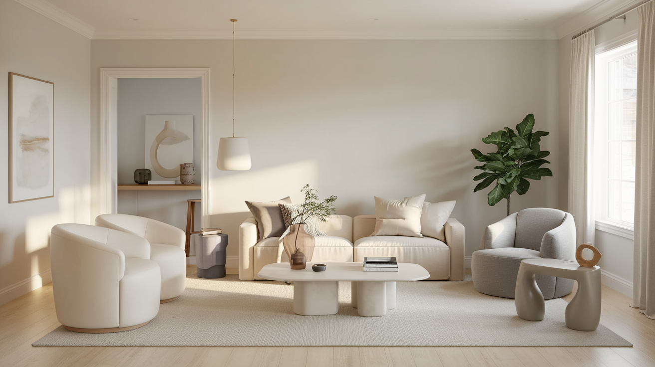
Living Rooms and Common Areas

Snowbound works beautifully in living rooms and family rooms.
Its warmth makes the space feel inviting, while its lightness keeps it from feeling too heavy.
It pairs well with both traditional and contemporary furniture, making it a versatile option for various home styles.
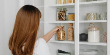
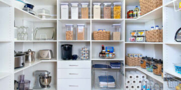
Kitchens and Dining Rooms

The kitchen is another great place for Snowbound.
Its light, creamy tone creates an airy, open feel, and it complements various cabinet colors and materials.
Whether you prefer light wood, stainless steel, or even colorful accents, Snowbound provides the perfect backdrop.
Additionally, its warmth makes it ideal for dining rooms where you entertain guests. It allows your decor to shine without competing for attention.
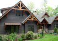
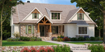
Exteriors and Trim

Snowbound works beautifully for exteriors, giving your home a soft, welcoming look that won’t appear too intense under the sun.
Unlike other whites that may feel too bright, Snowbound maintains its warmth and depth, ensuring a balanced, inviting appearance.
It’s perfect for trim, creating a clean contrast with darker accent colors.
When applied to the siding or architectural details, this color enhances the overall design, adding a modern yet timeless touch to the exterior of your home.
It complements various styles effortlessly, making it a versatile choice for any home.
Common Mistakes & Fixes
Mistake: Choosing Snowbound Without Considering Undertones
Fix: Snowbound has warm undertones, which may appear differently in various lighting.
If your room has warm, yellow lighting, it might make Snowbound feel even warmer, and vice versa. Always test the color to see how it interacts with your room’s light before committing.
Mistake: Not Considering Room Size
Fix: Snowbound works best in medium to large rooms. In smaller spaces, its warm undertones can make the room feel tighter.
If you’re working with a small space, consider a brighter white instead to keep the room feeling open.
Mistake: Not Matching Snowbound with the Right Decor
Fix: Snowbound pairs well with both traditional and contemporary furniture, but if you have bold or contrasting colors in the room, it could clash. Consider neutral tones like Agreeable Gray (SW 7029) or accent colors like Tricorn Black (SW 6258) to balance the look.
Alternatives to Snowbound
If you’re considering Snowbound but want something with a slightly different vibe, here are a few similar Sherwin-Williams shades :
- Ceiling Bright White(SW7007): Slightly brighter, with less warmth, Pure White is a great option for a cleaner, more contemporary look.
- Alabaster (SW 7008): Warmer and creamier than Snowbound, Alabaster has a slightly yellow undertone, which gives it a more vintage feel.
- Eider White (SW 7014): A softer, grayer white that still carries warmth, Eider White can be a great alternative if you want a bit more coolness without losing the warmth.
Best Ways to Test Snowbound Before Committing
It’s always a good idea to test a paint color before fully committing to it. Here are the best ways to test Snowbound in your space:
- Try Samples on Your Walls: Purchase small paint samples and apply them in different areas of the room. This will help you see how the color interacts with natural and artificial lighting.
- Use Peel-and-Stick Samples: These are an easy and mess-free way to see how Snowbound looks in your space without the commitment.
- Utilize the Sherwin-Williams Color Visualizer: Use the Sherwin-Williams Color Visualizer to digitally test how Snowbound looks in your space before you even buy a sample.
Testing the color will help ensure that it complements your room’s unique lighting and atmosphere before you fully commit.
Colors That Complement Snowbound

Neutral Shades
- Extra White (SW 7006): For a clean contrast, Extra White works wonderfully as a trim or accent color against Snowbound. It brightens the space and adds subtle definition.
- Agreeable Gray (SW 7029): This warm gray pairs nicely with Snowbound for a softer, neutral look that works well in living rooms and dining areas.
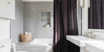
Bold Accents
- Tricorn Black (SW 6258): If you’re looking for contrast, Tricorn Black adds boldness to Snowbound, creating a striking, modern look. This pairing works particularly well in bathrooms or accent walls.
- Sage Green (SW 2860): Soft green tones, like Sage Green, complement Snowbound’s warmth and create a calm, nature-inspired vibe in kitchens and living rooms.
Natural Wood Tones
For those who love a natural vibe, Snowbound pairs beautifully with wood.
Whether it’s light English Walnut (SW 3574) or reclaimed wood, Snowbound brings out the warmth and texture of the wood, enhancing your space’s natural beauty.
Conclusion
Sherwin-Williams Snowbound (SW 7004) perfectly balances lightness and warmth.
Its creamy, neutral tone works well in nearly any space—If you’re designing a living room, kitchen, or exterior.
Its subtle undertones shift with the light, giving your home a dynamic yet comforting atmosphere.
Snowbound pairs beautifully with various colors, from bold accents to neutral tones and natural wood.
Before you decide, test Snowbound in your space to see how it interacts with your lighting.
If you’re looking to refresh a room or add warmth to your home, Snowbound is a reliable, timeless choice.
Frequently Asked Questions
Does Snowbound Work in Modern or Traditional Spaces?
Yes, Snowbound is highly versatile and works well in both modern and traditional interiors due to its neutral, timeless appeal.
How Does Snowbound Pair with Wood Tones?
Snowbound complements natural wood tones beautifully, raising the richness of wood while maintaining a fresh and balanced look in any room.