


Looking for a versatile neutral that complements any room? Benjamin Moore Calm might be the shade you need.
Finding the right white paint isn’t easy. After testing many shades, I’ve fallen in love with Benjamin Moore Calm (OC-22).
This soft off-white has become my top pick for a gentle, adaptable neutral.
What makes this color special? The magic lies in its subtle lavender-gray undertones. These create a soothing feel that changes with the light.
Let me show you how this beautiful shade can transform your space.
What is Benjamin Moore’s Calm?
Benjamin Moore Calm (OC-22) is a soft off-white paint color that balances warm and cool tones with its subtle lavender-gray undertones.
Light Reflectance Value (LRV)

Calm has an LRV of 77.7, placing it high on the light reflectance scale.
This number tells us it reflects a lot of light into your space, making rooms feel open and bright. Yet it’s not so bright that it feels stark or harsh.
The LRV makes it perfect for both small rooms that need more light and larger spaces that need a gentle glow.
Why is It Called ‘Calm’?
This paint color lives up to its name perfectly.
Natural daylight creates a peaceful atmosphere that helps reduce visual noise in your space. As sunlight moves throughout the day, the color stays steady and gentle.
It doesn’t show dramatic shifts that might feel jarring.
Instead, it maintains a consistent, relaxing presence that makes any room feel more peaceful.
Decoding Calm’s Undertones
Understanding the layers in Benjamin Moore Calm helps you predict how it will look in your space.
Let’s break down its complex but subtle color profile.
Beige with Subtle Gray

The gray undertones in Calm play a crucial role in its versatility. They add depth without making the color feel cold or flat.
When you look at Calm on your walls, you’ll notice it stays soft and balanced.
Unlike pure beige colors that can feel too yellow, the gray element keeps Calm feeling current and refined.
This balance makes it work well with both modern and classic design styles.
Hidden Purple Undertones
In morning and evening light, you might catch a hint of purple in Calm.
This subtle note appears most often in north-facing rooms or during sunset.
The purple isn’t obvious – it’s more like a soft whisper that adds warmth.
These purple notes blend smoothly into the background in bright daylight, letting the main color shine through.
How Undertones Affect Perception
The way you see Calm changes based on three main factors.
First, natural light plays a big role, south-facing rooms bring out its warmth while north-facing spaces highlight the gray.
Time of day matters too, morning light shows different undertones than afternoon sun.
Finally, nearby colors can pull out different aspects of Calm.
White trim makes it look warmer, while cool grays bring out its purple hints.
How Calm Compares to Other Colors
Let’s look at how Benjamin Moore Calm stands next to similar paint colors.
These comparisons will help you pick the right shade for your home.
Calm vs. Paper White

While both colors fall in the off-white family, they have distinct personalities.
Paper White reads cooler with its clean, crisp look. Calm feels softer and more muted, with its beige base adding warmth to spaces.
Paper White appears brighter and more reflective in natural light, while Calm offers a gentler glow.
This makes Calm better suited for creating cozy spaces, while Paper White works well in modern, minimalist settings.
Calm vs. Silver Satin

Silver Satin has stronger gray undertones that make it appear cooler than Calm.
In side-by-side tests, Calm shows more warmth and depth.
Silver Satin can feel more contemporary with its silvery notes, while Calm maintains a softer, more traditional feel.
When light hits these colors, Silver Satin reflects a cooler glow making it ideal for bright spaces.
Best Uses for Benjamin Moore Calm
Every paint color has its sweet spots where it works best.
Here’s where Calm truly shines in your home and why it works so well in these spaces.
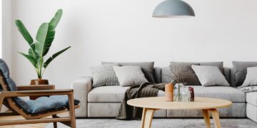
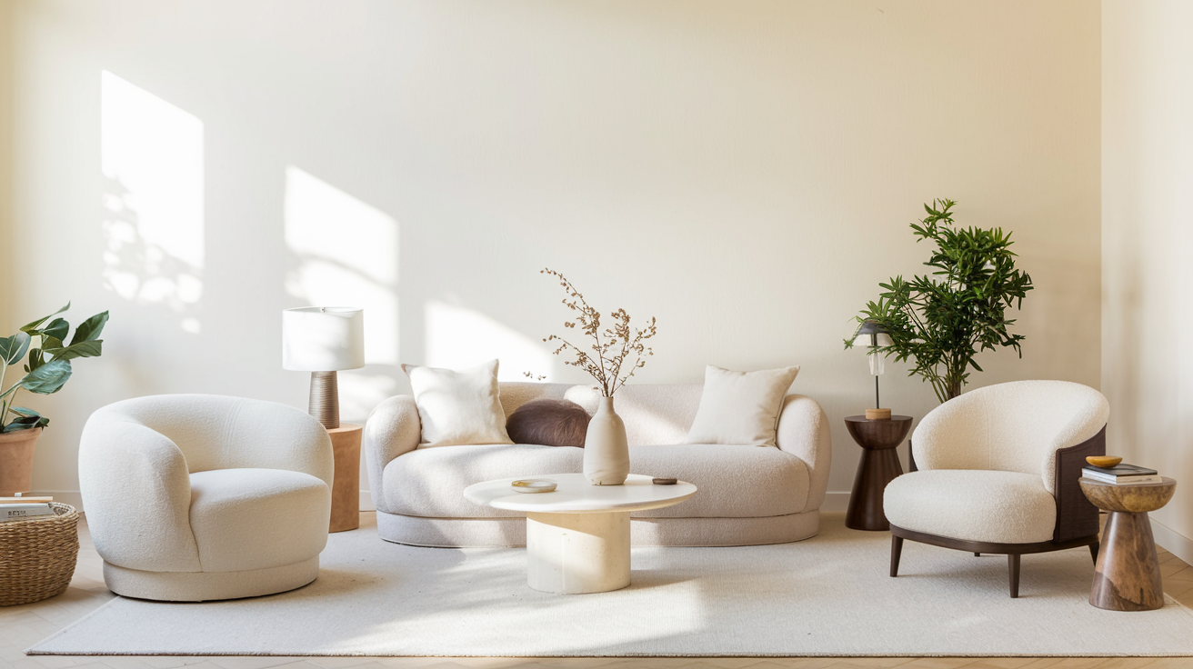
Living Rooms and Family Rooms

In main living areas, Calm creates a welcoming atmosphere that adapts throughout the day.
The color stays soft in the morning light and warms up as the sun moves across your space.
It works well with both light and dark furniture, making it perfect for family rooms.
The color helps tie everything together without competing for attention.
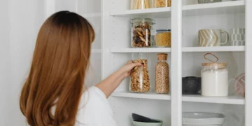
Kitchens
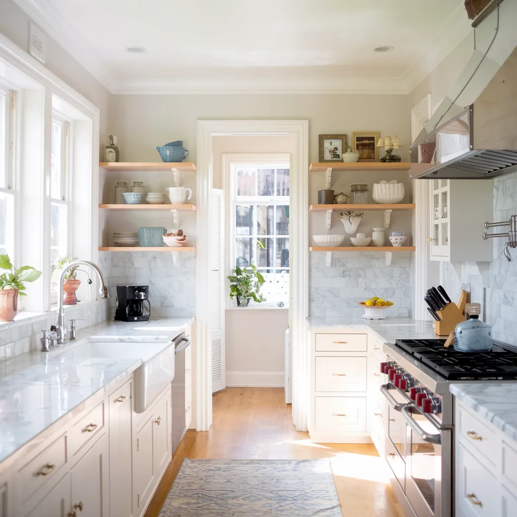
Calm proves its worth in kitchens by making the space feel clean and fresh without being stark.
It pairs beautifully with white cabinets, making them pop without creating harsh contrast.
The color also works well with wood tones, stone countertops, and stainless steel appliances.
In kitchen lighting, it maintains its warmth while staying light enough to brighten the space.
Bedrooms
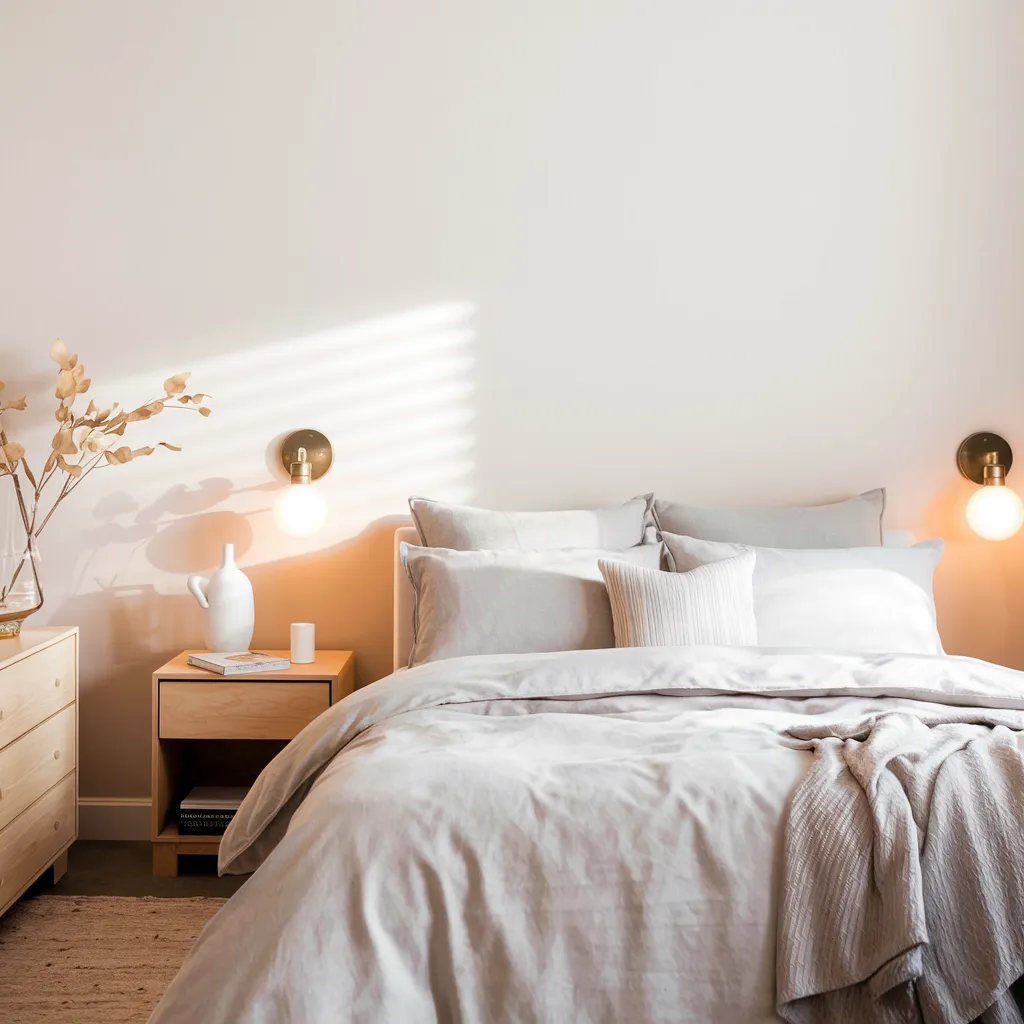
In bedrooms, Calm creates the perfect sleep environment.
The color feels soft and gentle in the morning light, helping you wake up naturally.
It takes on a cozy quality at night that helps you wind down.
It works especially well with light bedding and natural textiles, creating a layered look that does not feel fussy.
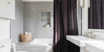
Bathrooms

Calm makes bathrooms feel fresh and clean while adding a touch of warmth. It complements white fixtures without creating a clinical feel.
The color stays true under different lighting conditions, from bright morning sun to soft evening light.
It makes small bathrooms feel bigger and helps large bathrooms feel more intimate.
Offices and Workspaces

For home offices, Calm creates a focused environment that helps you stay productive without feeling cold.
The color reduces glare on screens while providing enough contrast for video calls.
It keeps your workspace feeling bright and clean during the day.
At night, under lamp light, it maintains its soft quality without turning dark or muddy.
How Lighting Affects Calm’s Appearance
Light changes everything when it comes to paint colors.
Let’s see how different types of lighting impact Benjamin Moore Calm’s true character.
Natural Light

Sunlight brings out the best in Calm throughout the day. The color never feels too bright or washed out, even in direct sunlight.
Morning sun highlights its soft, gentle side, making rooms feel fresh and bright.
By midday, the color stays true to its base tone, creating a clean backdrop.
Late afternoon sun can bring out warmer notes, making spaces feel cozy.
Artificial Light

Your choice of light bulbs can shift how Calm appears in your space.
Warm LED bulbs bring out its cozy side, perfect for evening relaxation.
Cool white bulbs keep the color crisp and clean, ideal for task-focused areas.
Standard bulbs maintain Calm’s natural balance.
Use daylight bulbs in spaces where you need to see true colors for the most accurate color appearance.
Tips for Choosing the Right Finish
Paint finish can make or break your color choice.
Here’s what you need to know about selecting the perfect finish for Benjamin Moore Calm.
Flat vs. Satin
Flat finish shows Calm at its softest, making it perfect for bedrooms and formal living rooms. This finish hides wall flaws but isn’t easy to clean.
Satin adds a subtle glow that works well in busy areas like hallways and family rooms.
For kitchens and bathrooms, a pearl or eggshell finish offers good durability while keeping the color true.
Each finish level changes how light bounces off the walls.
Sheen Impact on Undertones
Higher sheens like satin and pearl can make Calm’s undertones more noticeable.
The way light reflects off these finishes brings out the subtle purple and gray notes.
A flat finish keeps the color more consistent but can make it appear slightly darker.
The eggshell finish offers the best mix of durability and accuracy for balanced results in most rooms.
Examples of Calm in Action
Let me show you how Benjamin Moore Calm performs in actual homes.
These examples will help you see its true potential in different settings.
Home Tours/Images

In Sarah’s living room, Calm creates a perfect backdrop for her mix of modern and traditional furniture. The color stays fresh through morning coffee and turns soft during movie nights.
In Michael’s kitchen, it brightens the space while working well with white cabinets and marble counters.
Lisa’s bedroom shows how Calm can make a small space feel bigger while keeping it cozy.
Before and After Scenarios

One transformation happened in Amy’s dining room. The old beige walls made the space feel dated and dark.
After painting with Calm, the room opened up and felt more current.
The color worked perfectly with her existing wood furniture while making her artwork stand out.
Natural light now fills the space differently, creating a more welcoming atmosphere for family gatherings.
Conclusion
After exploring Benjamin Moore Calm, I can say it’s a fantastic choice if you want a versatile neutral.
From my testing in different spaces, this color truly adapts to your needs while maintaining its gentle character.
Remember to grab a peel-and-stick sample before making your final decision.
Watch how it looks in your space during different times of day. Pay attention to how it works with your lighting and furniture.
Want my final take?
Calm is perfect if you’re looking for a soft, adaptable neutral that won’t feel stark or cold.
Its subtle mix of warmth and gray undertones creates fresh yet cozy spaces.
Frequently Asked Questions
What are the Most Calming Benjamin Moore Colors?
Benjamin Moore’s most calming colors include Calm OC-22, Cloud White, Pale Oak, Gray Owl, and Revere Pewter. Each offers a gentle, soothing presence in any room.
What is the Most Relaxing Color for a Living Room?
Soft blues, warm grays, and gentle greens create the most relaxing living rooms. Colors like Benjamin Moore’s Calm, Pale Oak, or Sea Salt work best.