


Sherwin-Williams Alabaster (SW 7008) is one of the most-loved off-white paint colors that has won many hearts since its release in 2016.
This gentle shade works wonderfully both inside and outside your home.
What makes it special? It’s a soft, warm white that feels cozy without being too yellow or stark.
Before you grab your paintbrush, it’s helpful to know how this color changes throughout the day and what makes it work so well in different spaces.
Let’s look at what makes Alabaster a popular choice and how you can use it in your home.
What Are the Undertones of Sherwin-Williams Alabaster?
Understanding the undertones of Alabaster helps you know how this paint will look in your space. The mix of subtle warm and cool elements makes this color special.
Let’s break down what gives Alabaster its unique character.
Sherwin-Williams Alabaster Undertones Explained
Look closely at Alabaster, and you’ll notice it’s not just plain white. It has a soft mix of yellow and gray that work together to create its special look.
This blend helps it match well with both warm items like brass lights and cool things like silver handles.
Think of it like a chameleon that gets along with different colors but keeps its own gentle personality.
You can see these subtle touches more clearly when you put it next to pure white.
Is Alabaster Warm or Cool?
Alabaster leans toward the warmer side but does so gently. The slight yellow makes rooms feel cozy without being too obvious about it.
It’s like having soft, warm light in your space all day long. This warmth makes it great for living rooms and bedrooms where you want to relax.
Even when the sun hits it directly, it stays soft and welcoming instead of looking harsh or bright.
Does Alabaster Look Yellow?
While Alabaster has hints of yellow, you won’t walk into a room and think, “this looks yellow.”
Instead, you’ll see a soft, creamy white that feels clean and fresh. Even when the light is low, like on cloudy days or in the evening hours, it keeps its clean look.
The color stays true and doesn’t turn murky or too warm, making it reliable for any room in your house.
Alabaster’s Balance Between Yellow and Gray
The magic of Alabaster comes from how it mixes yellow and gray tones just right.
This mix gives the color more depth than plain white but keeps it light enough to feel fresh.
It works well in kitchens, living rooms, and bedrooms because it’s not too warm or too cool.
This balance helps it look good all day long, no matter how the light changes.
Light Reflectance Value (LRV) and Its Impact
Let’s talk about how much light Alabaster bounces back into your room – that’s what LRV means in simple terms.
This number helps you know if a color will make your space feel bright or muted.
For Alabaster, this value tells an important story about how it works in different spaces.
What is the LRV of SW Alabaster?
Alabaster has an LRV of 82, which means it bounces back 82% of the light that hits it.
This makes it bright but not blinding – think of it like a soft glow rather than a bright flashlight.
When sunlight moves through your room during the day, Alabaster keeps spaces feeling open and airy without creating glare.
It’s bright enough to make rooms feel spacious but gentle enough to stay comfortable.
Does Alabaster Work Well in Low-Light Rooms?
In rooms that don’t get much natural light, Alabaster really shows its strengths.
The color keeps spaces feeling bright even when sunlight is limited. It’s like having a built-in light enhancer for your walls.
Even in basement rooms or north-facing spaces, it maintains its clean look instead of turning dark or dull.
This makes it a great choice for any room that needs a brightness boost.
Using Sherwin-Williams Alabaster in Different Settings

Understanding where to use Alabaster can help you make good choices for your home.
This color works in many spots and adds a clean, soft look to any space.
Let’s look at the best ways to use it both inside and outside your home.
Interior Applications
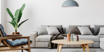
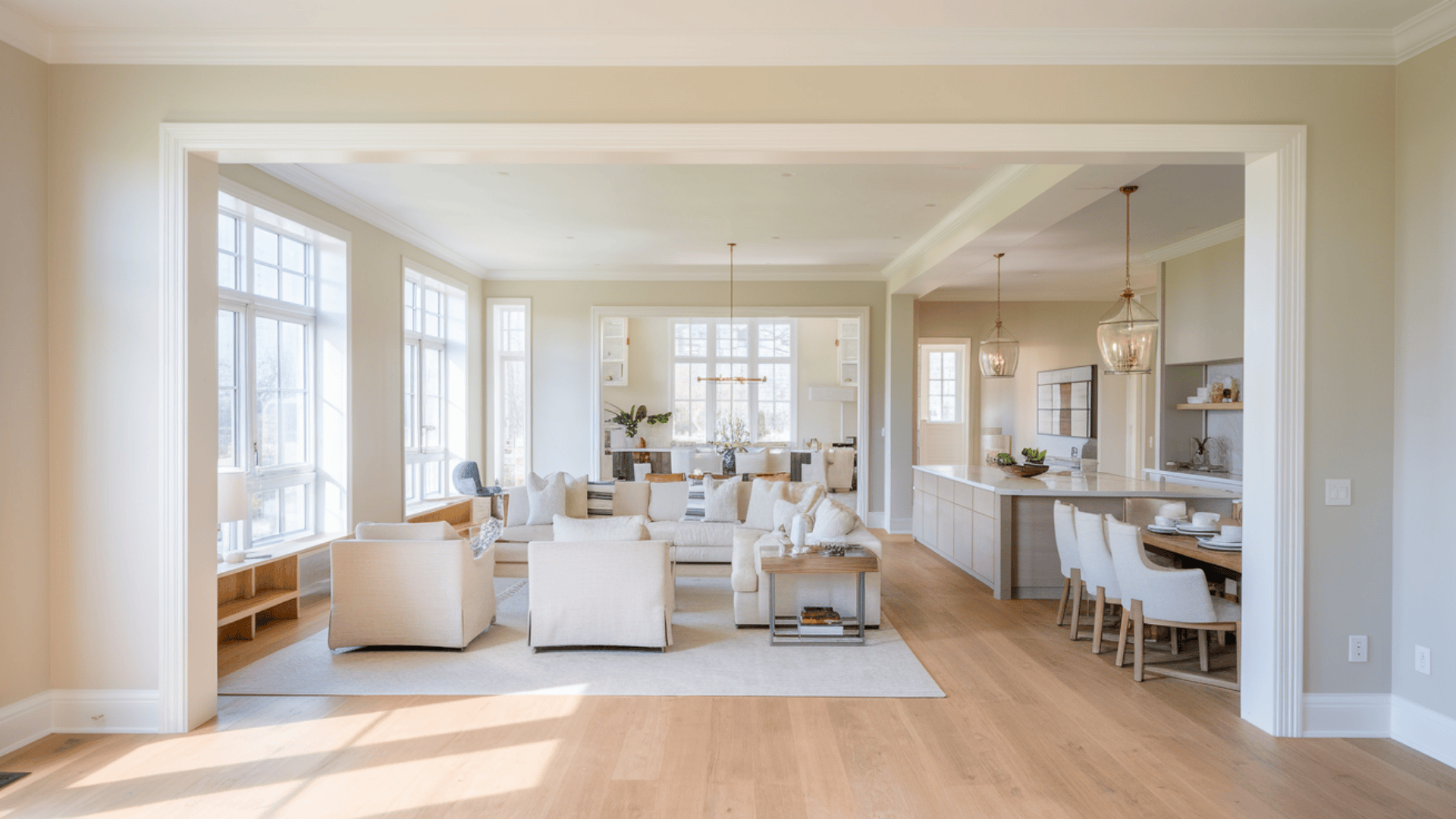
Alabaster brings a soft, clean touch to walls, making rooms feel open and bright.
- It looks great in kitchens, where it makes counters and appliances stand out nicely.
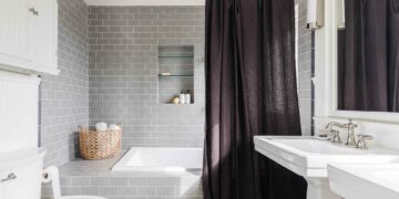
- In bathrooms, it adds warmth without feeling too yellow.
- Living rooms painted in Alabaster feel cozy but stay bright.
The color fits well with wood floors, stone features, and different types of furniture. It works equally well with modern metal pieces or classic wooden furniture.
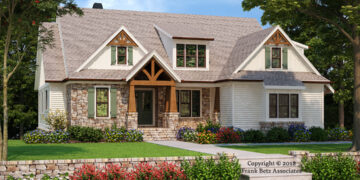
Exterior Applications
Alabaster makes a subtle statement about house exteriors.
It looks best in homes with lots of trees or plants around them, which creates a nice contrast with the green surroundings.
In full sunlight, it stays soft rather than looking too bright or harsh.
If your home gets lots of shade, Alabaster helps keep it looking fresh and clean instead of fading into the background.
As a Trim and Cabinet Color
On trim and cabinets, Alabaster creates a soft look that’s cleaner than pure white.
It makes a nice frame for darker wall colors without creating too sharp a difference.
The kitchen cabinets in Alabaster feel fresh but homey, and they work well with many countertop colors.
When used on door frames and baseboards, it adds a finishing touch that ties rooms together without drawing too much attention.
Comparing Sherwin-Williams Alabaster with Other Whites
| Features | Alabaster | Pure White | Extra White | White Dove | Swiss Coffee |
|---|---|---|---|---|---|
| LRV | 82 | 84 | 86 | 85 | 84 |
| Undertone | Soft yellow with gray | Neutral | Blue-white | Soft gray | Strong yellow |
| Best Lighting | All lighting types | Bright natural light | Strong natural light | Medium to bright light | Low to medium light |
| Vibe Match | Modern and classic | Modern | Very modern | Traditional | Farmhouse, cozy |
| Best Uses | Walls, trim, cabinets | Trim, doors | Trim, modern spaces | Walls, cabinets | Walls, warm spaces |
| Temperature | Warm neutral | True neutral | Cool | Soft neutral | Very warm |
Best Ways to Use Sherwin-Williams Alabaster

Let’s look at how to pair Alabaster with other colors and use it throughout your space.
Getting these combinations right can make your rooms look put together and feel peaceful.
Pairing Alabaster with Other Colors
Alabaster makes friends with lots of different colors, but some combinations work better than others. Here’s what looks best:
Colors that work well with Alabaster:
- Soft grays (like SW Agreeable Gray) for a calm look
- Deep blues (like SW Naval) for nice contrast
- Earth-toned browns that match wood furniture
- Green-grays (like SW Sea Salt) for a natural feel
- Black (like SW Iron Ore) for modern contrast
- Natural wood tones from light oak to dark walnut
To make these pairings work:
- Add darker colors through furniture and art
- Bring in natural materials like wood and stone
- Use textiles in complementary colors
- Mix in metal finishes like brass or silver
Color Drenching with Alabaster
Using Alabaster on all surfaces creates a flowing, peaceful space. Here’s how to do it right:
Sheen guide for all-Alabaster rooms:
- Walls: Matte or eggshell finish for a soft look
- Trim: Satin finish for subtle shine
- Ceilings: Flat finish to hide imperfections
- Doors: Satin or semi-gloss for durability
- Cabinets: Semi-gloss for easy cleaning
Tips for the all-Alabaster look:
- Mix different paint finishes to add depth
- Add texture through fabrics and materials
- Include natural elements for warmth
- Layer in lighting at different heights
- Use mirrors to boost natural light
What Makes Sherwin-Williams Alabaster the Best Choice?

SW Alabaster has become a favorite white paint color, but what makes it so loved?
From its easy-going nature to real success stories in different homes, this color proves itself time and time again.
A True Team Player
Alabaster brings out the best in any space without taking over. This gentle white makes artwork stand out and lets furniture shine.
In modern homes, it adds warmth to clean lines and sleek surfaces. In older homes, it respects traditional features while adding freshness.
It’s like a good friend who gets along with everyone and makes them look good too.
Creating Calm Spaces
This soft white brings a sense of peace to any room.
It’s not too bright or too dim – just right for making spaces feel open and welcoming.
When you walk into a room painted in Alabaster, you’ll notice how it feels both clean and comfortable.
The color stays gentle on your eyes throughout the day, making spaces feel naturally bright without any harshness.
Alabaster in Everyday Kitchens
Alabaster makes every element look crisp and fresh.
Small kitchens feel bigger, and cooking spaces stay bright. Living rooms become more inviting, with the paint creating a perfect family time and entertainment setting.
It stays clean-looking on house exteriors throughout the changing seasons. Gardens and plants look richer against its soft white background.
Practical Benefits
Beyond its good looks, Alabaster is a practical choice.
It forgives small wall imperfections better than stark whites do.
The color looks steady under all types of lighting, from morning sun to evening lamps.
When you need to fix a scratch or mark, touch-ups blend in smoothly. It’s a color that keeps working well year after year.
Should You Use Alabaster White in Your Home?

Making the final choice about a paint color needs careful thinking.
Let’s look at when Alabaster shines best and what to check before you buy those paint cans.
When Alabaster Works Best
Alabaster fits right in from room to room, making your whole house feel connected.
In kitchens, it helps light bounce around while staying soft on the eyes. Bedrooms feel cozy but bright, and living spaces stay fresh all day long.
The color stays true in sunny spots but adds just enough warmth to darker corners. It makes small rooms feel open and large rooms feel welcoming.
Considerations Before Choosing Alabaster
Before you commit to Alabaster, take time to test it in your space.
Buy a few peel-and-stick samples and put them on different walls.
Watch how the color looks from morning to night – you’ll want to see it in bright sun, cloudy weather, and under your lights.
Check how it works with your floors, counters, and furniture. Move the samples around to different spots and heights on your walls.
Testing Tips
- Place samples on each wall of the room
- Look at the color during different times of day
- Check how it looks next to your trim and doors
- See it near your furniture and curtains
- Test it under both natural and artificial light
Conclusion
Picking the right white paint can make such a difference in your home.
Sherwin-Williams Alabaster (SW 7008) stands out because it does something special – it stays true to itself while making everything around it look good too.
Think of it as the perfect middle ground: not too warm, not too cool, just right.
Before you start painting, remember to try it out in your space. Watch how it changes with the light and see how it feels with your furniture and decor.
When a paint color fits just right, you’ll know it – and that’s what makes Alabaster worth considering for your home.