


When selecting the perfect neutral for your home, the variety of grays available can be overwhelming.
Benjamin Moore Collingwood (OC-28) might be the ideal color if you’re looking for a warm and inviting shade.
With its subtle beige undertones, this light gray is a favorite among homeowners and designers alike for its versatility and understated style.
If you’re looking to refresh a single room or redesign your entire home, Collingwood offers a perfect balance of light and warmth, making it suitable for virtually any space.
In this blog, we’ll share everything you need to know about Collingwood — from its unique undertones to how to incorporate it into your home design.
By the end, you’ll understand why this gray should be at the top of your list.
Why Collingwood Stands Out: A Balance of Light and Warmth
Unlike cooler grays, which sometimes feel too harsh, Benjamin Moore Collingwood leans toward a warmer, softer side.
Its subtle blend of gray with soft beige undertones makes it the perfect choice for those who want gray’s calm, neutral quality without the coldness that other shades may bring.
One of the biggest draws of Collingwood is its ability to work seamlessly across different types of interiors.
This gray can adapt to a modern, minimalist space or a more traditional, cozy atmosphere.
It creates a serene and inviting environment, so it’s often used in bedrooms, living rooms, and even kitchens.
Understanding Collingwood’s Unique Character
The Perfect Balance of Warmth and Light
Collingwood strikes an ideal balance with its warm undertones, unlike cooler grays that can feel harsh or clinical.
The color maintains its gray base while incorporating subtle beige notes, creating a refined neutral that feels both contemporary and welcoming.
A Closer Look at Undertones
Collingwood’s undertones are what truly set it apart:
- Primary undertone: Soft beige that provides warmth
- Secondary notes: Subtle taupe that adds depth
- No purple or green undertones that can make some grays feel cold
The Science of Light: LRV and Room Impact
With an LRV (Light Reflectance Value) of 63, Collingwood sits in the sweet spot of the medium-light range. This means that:
- Reflects enough light to brighten spaces without causing glare
- Maintains its color integrity in both bright and dimmer conditions
- Creates an excellent backdrop for artwork and furnishings
Seasonal Considerations
Natural Light Changes
- Spring/Summer: Color appears lightest and warmest
- Fall/Winter: Takes on a slightly cooler, more gray appearance
- Morning light: Brings out warm undertones
- Evening light: Creates a softer, more muted effect
Best Application Timing
- Ideal temperature range: 65-85°F
- Optimal humidity: 40-50%
- Best seasons: Spring and Fall
- Avoid painting during extreme temperature conditions
Complementary Colors for Collingwood
One of the main advantages of Collingwood is its versatility in pairing with other colors.
It blends beautifully with a wide range of hues, allowing you to create diverse looks based on your preferences and needs.
Below are a few complementary colors that work wonderfully with Collingwood in various settings:
1. Soft Neutrals and Creams
If you’re looking for a subtle, cohesive palette, pairing Collingwood with soft neutrals like cream, beige, or off-white creates a calm and serene space.
This combination is perfect for bedrooms, bathrooms, or any area where you want a relaxed, inviting atmosphere.
Best Matches:
2. Rich, Deep Grays
You can pair Collingwood with darker, more intense grays for a more modern and refined look.
This creates a balanced contrast that adds depth to the room without feeling too dark or moody.
Best Matches:
3. Earthy Tones and Greens
Combine Collingwood with muted greens or soft brown tones for a more organic, nature-inspired design.
The earthy elements work beautifully with the warm undertones in Collingwood, creating a grounded, natural feel.
Best Matches:
4. Warm Wood Tones
Pairing Collingwood with natural wood tones brings a rustic warmth to your space.
Whether it’s oak, walnut, or cherry wood, the combination of soft gray with rich wood accents creates a balanced and timeless look.
Best Matches:
- Stain Color Classic Cherry (SW 3110) and Walnut Stain(MW439).
- Roy Croft Copper Red(SW2839), Green Vibes(SW6928) complement the warmth in Collingwood
5. Soft Pastels
Pair Collingwood with pastel tones such as pale pinks, blues, or lavender for a softer, lighter look.
This combination works well for nurseries, bedrooms, or spaces where you want a light and refreshing vibe.
Best Matches:
How to Use Collingwood in Your Home
Due to its versatility, Collingwood works well in various areas of the home.
Here are a few ways you can incorporate this soft gray into your space:
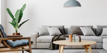
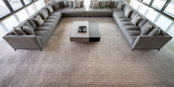
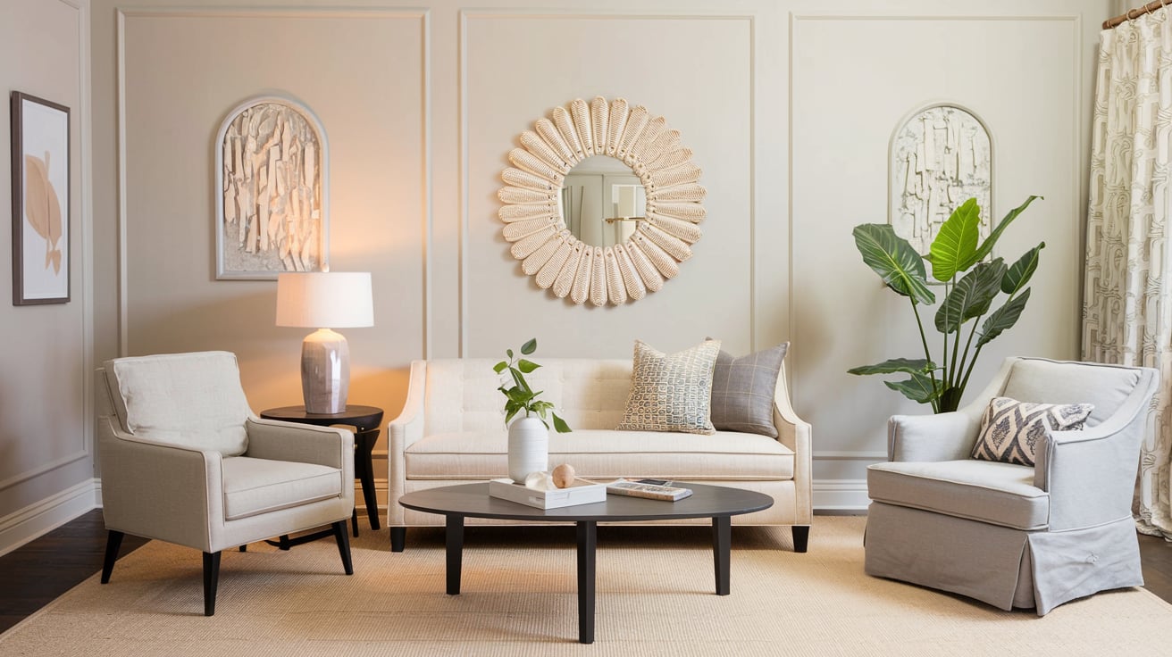
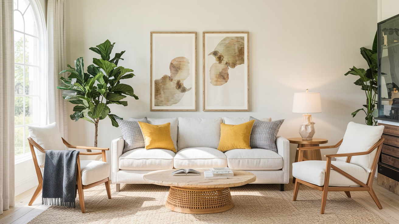
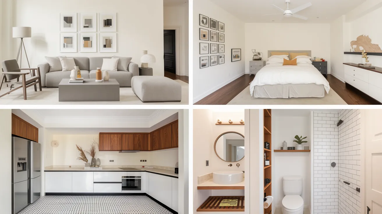
Living Room
Collingwood can provide a light and airy atmosphere in the living room while feeling warm and inviting.
Pair it with soft neutrals, deep Grays, or pops of rich colors to create a space that feels refined yet comfortable.
The warmth in the color makes it ideal for creating a cozy setting for entertaining or relaxation.
Bedroom
Collingwood is an excellent choice for the bedroom if you’re after a serene, restful retreat.
Its subtle warmth helps promote relaxation and pairs beautifully with soft whites, pastel tones, or rich wood furniture.
The neutral color allows you to easily switch up your bedding and accessories and refresh your space whenever you like.
Kitchen
Collingwood provides a fresh, neutral backdrop for your cabinetry and countertops in the kitchen.
Pair it with white or Gray cabinets, stainless steel accents, or warm wood finishes for a clean, timeless look.
If you’re going for a modern or classic style, this soft Gray works beautifully in the heart of your home.
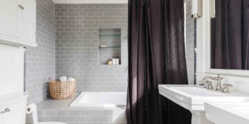
Bathroom
In the bathroom, Collingwood creates a spa-like, best atmosphere.
Combine it with white tiles, natural stone, or even wood accents to create a refined, relaxing space.
Its ability to reflect light while maintaining warmth makes it a great choice for bathrooms with limited natural light.
Final Thoughts
Benjamin Moore Collingwood is a soft, refined Gray that can uplift any room in your home.
Its balanced undertones of Gray and beige create a versatile, warm neutral that works well in various settings.
If you’re designing a modern, minimalist space or a traditional, cozy retreat, Collingwood offers the flexibility and timeless appeal you’re looking for.
Its moderate LRV reflects just the right amount of light, making it perfect for bright and dimly lit rooms.
The range of complementary colors you can pair with Collingwood only adds to its versatility, allowing you to create a space that is uniquely yours.
If you’re searching for a color that strikes the perfect balance between light and warmth, Collingwood is an excellent choice to enhance your home for years to come.