


French Canvas by Benjamin Moore brings any room a soft, comforting feel.
This paint color sits between gray and beige, making it a top choice for people who want a calm, welcoming space.
The color changes slightly as sunlight moves through your home. It shows warm beige hints in bright areas, while in shadowy spots, it leans toward gentle gray tones.
Many people love how it works well with modern and classic furniture styles.
French Canvas might be the right choice for your walls to make your space feel more peaceful and put together.
It’s a paint color that simultaneously makes rooms feel stylish and comfortable.
What is French Canvas by Benjamin Moore?

French Canvas (OC-41) is a gentle off-white paint color that brings subtle green-gray hints to your walls.
It’s part of Benjamin Moore’s Classic Color Collection, sitting in the neutral family that makes spaces feel balanced and calm.
Color Profile
When you put French Canvas on your walls, you’ll notice how it shifts with the light.
It shows its cooler side in north-facing rooms, bringing out soft gray tones that feel fresh and clean.
It stays balanced in rooms that get southern or eastern light – not too warm or cool.
The morning sun brings out its warmer side, while the afternoon light shows its greener notes.
Why French Canvas Stands Out
This painting is special because it mixes green and gray hints without getting too yellow.
It’s deeper than a basic white but lighter than most beiges. Many interior designers say it adds depth to rooms without making them dark.
The color works as a base, making light and dark furniture look good.
It’s not just another white or beige—it has its own character that shows up differently as the light changes throughout the day.
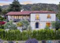
Where to Use French Canvas

This versatile paint color works well in many areas of your home.
Here are the best places to use it and how it pairs with different materials.
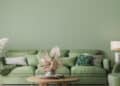
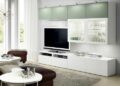
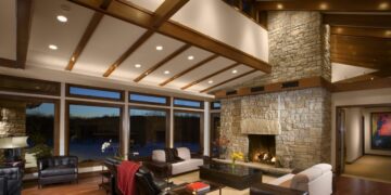
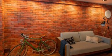
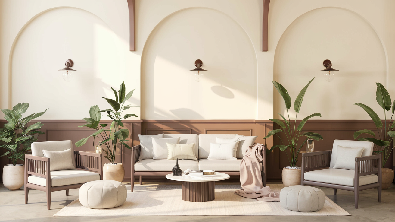
Living Rooms
French Canvas makes living spaces feel warm and pulled together.
It creates a background that lets your furniture and decor shine while keeping the room feeling open and bright.
The color helps make gathering spaces feel more welcoming without taking attention away from your personal touches.
Bedrooms
In sleeping spaces, French Canvas brings a sense of peace.
It’s light enough to keep the room feeling fresh but has enough color to make the space feel snug.
The green-gray hints help create a quiet feeling that’s perfect for rest.
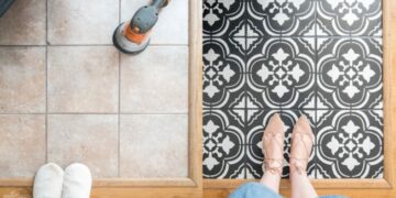
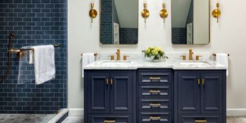
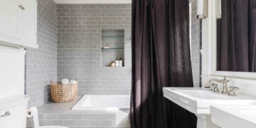
Bathrooms
This paint adds warmth that basic white can’t match when used in bathrooms.
It makes the space feel clean and fresh while adding just enough color to keep things interesting.
The paint works well with both chrome and brass fixtures.
French Canvas on Woodwork
This paint color makes a great match for different wood types.
It pairs beautifully with light oak and darker walnut finishes on trim and doors. The color looks especially good next to muted blue cabinets or dusty lilac accents.
For built-ins and window frames, French Canvas helps bring out the natural beauty of wood grain while keeping the look clean and current.
Decor with French Canvas

Let’s examine the best ways to use this paint color with other design elements and how different types of light affect its appearance.
Pairing French Canvas with Other Colors
French Canvas works well with many color combinations. Here are some tried and tested pairings:
Soft Whites
Paint trim and ceilings in clean whites, like Chantilly Lace or White Dove, to create a subtle contrast that makes rooms feel bigger.
Metals and Accents
Bronze and brushed nickel fixtures look natural against this paint. For warmth without making the space feel showy, add touches of matte gold or aged brass.
Natural Materials
Light maple and honey-toned oak furniture bring out the warm side of French Canvas. Dark woods like walnut or mahogany create a nice contrast while keeping the room balanced.
The paint is perfect for French country settings. Its soft color makes old furniture and antique pieces look at home without feeling dated.
Lighting Considerations
The way French Canvas looks changes based on your room’s light:
North-Facing Rooms
The paint shows more of its gray side, creating a cool, calming feel. If necessary, add warm-toned lamps to balance the coolness.
South-Facing Rooms
The morning and afternoon sun bring out the paint’s warmer tones. The color stays light but adds depth that plain white doesn’t offer.
Light Levels
In bright spots, French Canvas keeps rooms from feeling too stark.
In darker corners, it helps reflect light while still adding more interest than basic white.
For rooms with mixed lighting, this paint helps tie different areas together.
Design Tips for French Canvas

Planning to use this paint? Here are some helpful tips to make sure you get the look you want.
Trim and Complementary Colors
When picking trim colors to go with French Canvas, you have several good options:
1. Warm Off-Whites
Colors like White Dove or Swiss Coffee on trim create a soft, connected look.
These whites aren’t too stark, so they keep the room feeling cozy while adding just enough contrast.
2. Muted Blues
For something different, try soft blue-gray trim. Colors like Smoke or Winter Lake can make a room feel special without being too bold.
This works well in spaces where you want to add some color without going too far.
3. Color Tip
Keep your trim color about two shades lighter or darker than French Canvas for the best results.
Avoiding Color Missteps
Before you buy gallons of paint, take these steps to make sure you’ll be happy with the results:
- Get Sample Cards: Look at the paint card next to your furniture, floors, and fabric during different times of day.
- Test Paint Patches: Put big paint samples on your walls – at least 2 feet by 2 feet. Watch how they look from morning to night.
- Check Different Walls: Paint samples on your room’s bright and dark walls. The same color can look quite different based on where you put it.
- Take Your Time: Live with the samples for a few days. This will help you see how the color complements your daily activities and existing items.
Conclusion
French Canvas does something special that not many paint colors can do – it makes spaces feel fresh and grounded simultaneously.
What’s great about it is how it shifts with your home’s natural rhythm, from bright mornings to quiet evenings.
People often tell us they’re surprised by how this paint makes their art and furniture look better, almost like it was made for their space.
If you’re stuck between white and beige or just want a color that will stay in style for years, French Canvas might be the answer.
The best part? You won’t need to repaint anytime soon – it’s a color that keeps looking good as your style changes.