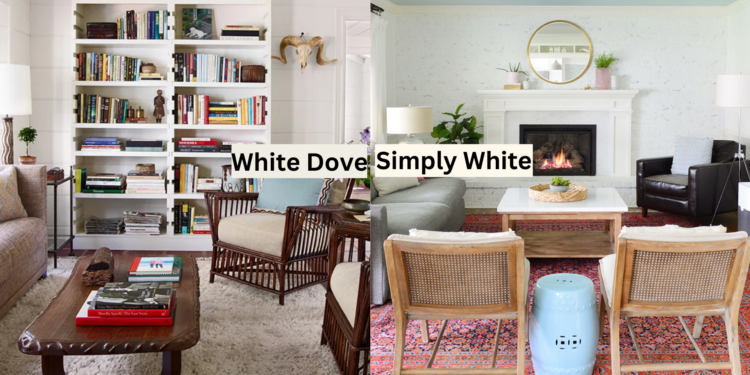
In the paint aisle, staring at countless white paint swatches, you may wonder if they differ.
The truth is that choosing the wrong white can make your space feel cold and clinical instead of warm and welcoming.
Benjamin Moore’s Simply White and White Dove are two of the most popular white paint colors – but they create distinctly different atmospheres in a room.
One brings crisp, bright energy, while the other offers soft, calming warmth. Choosing between these two beloved whites can transform your space from stark to beautiful.
In this guide, we’ll examine the unique characteristics of Simply White and White Dove, helping you determine which shade will create your perfect white room.
Understanding Simply White and White Dove
Before jumping into their differences, let’s look at these two shades closer.
Simply White
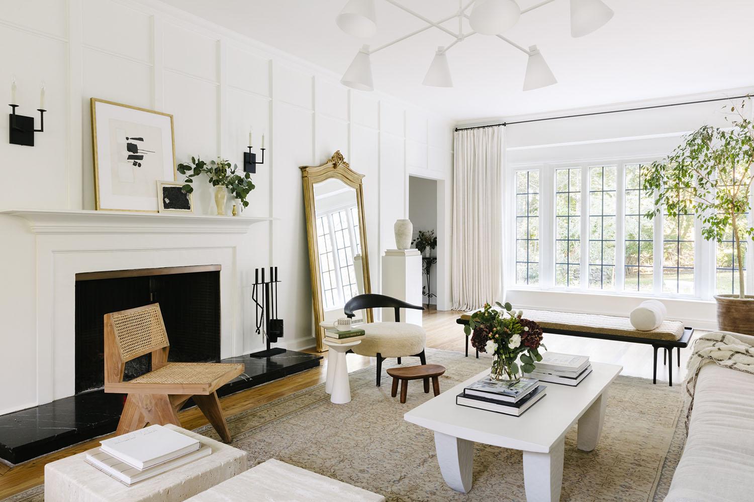
Simply White is often described as a soft, clean white. It’s a bright shade but not so stark that it feels cold or clinical.
While predominantly white, subtle undertones give it warmth, particularly in natural light.
This warmth makes it an ideal choice for homeowners who want a bright and welcoming space but don’t want the cold, sterile feel that some whites can bring.
The undertones in Simply White are faintly yellow and green, giving it a warmth that helps balance the brightness.
This makes it a versatile choice for both modern and traditional spaces, offering the crispness of white without feeling too harsh.
White Dove
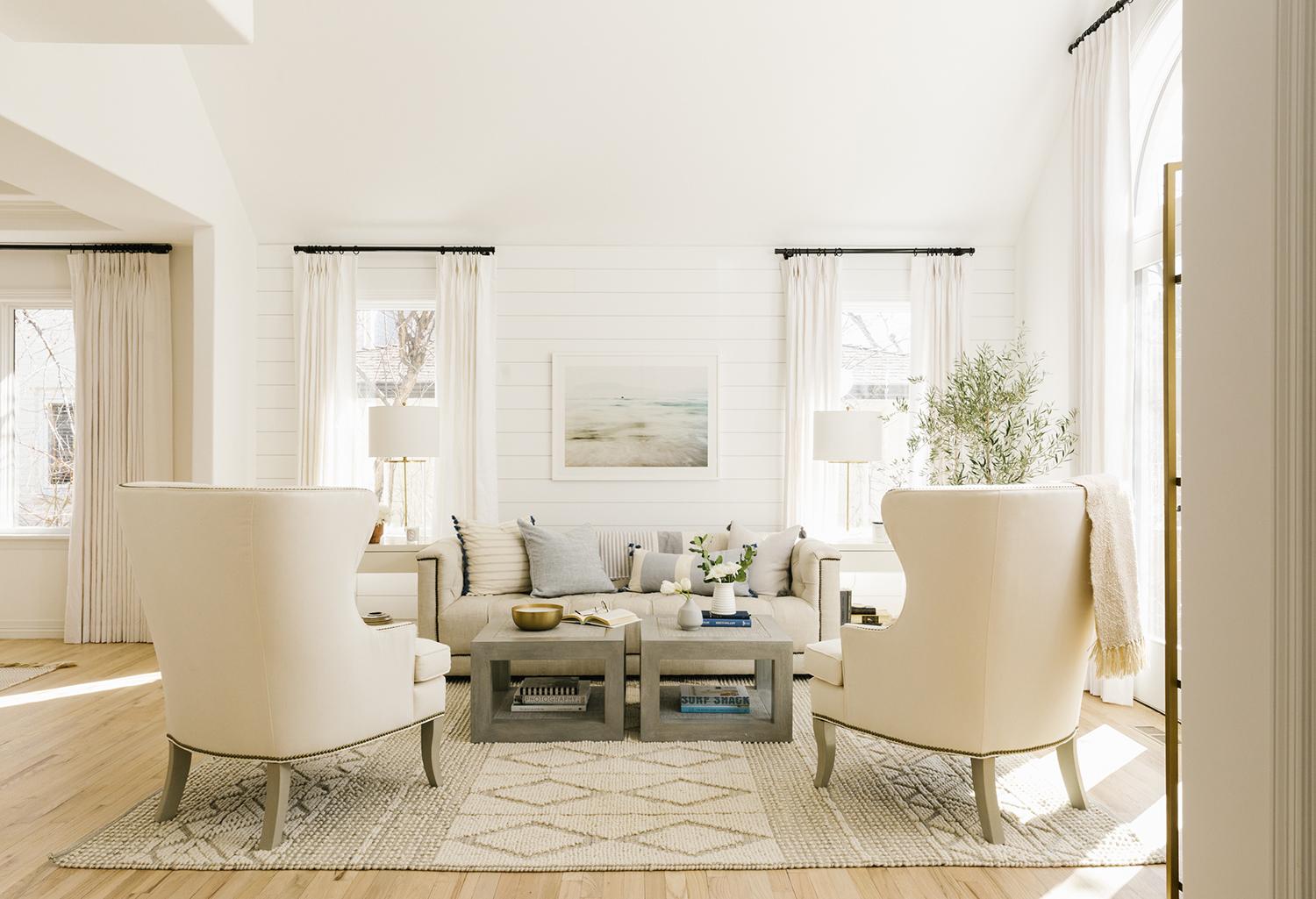
On the other hand, White Dove is a softer, more muted white with a very subtle Greige (Gray-Beige) undertone.
While it is still technically considered an off-white, its understated nature gives it a quieter, more serene quality than Simply White.
This makes it perfect for spaces where you want a sense of calm and subtle refinement.
White Dove isn’t as bright as Simply White, but it’s still light enough to feel open and airy without being overly stark.
Because of its neutral undertones, White Dove can be seen as a “safer” choice for those who want a classic, understated look that works well with various color palettes.
Paint Finishes and Their Effects
Different finishes can dramatically change how these whites appear in your space.
Finish | Simply White | White Dove |
Matte/Flat (0-5% gloss) | Creates a soft, velvety appearance; ideal for low-traffic areas | Provides excellent depth; perfect for hiding wall imperfections |
Eggshell (10-25% gloss) | Offers a subtle sheen while maintaining the crisp white appearance | Enhances the warm undertones; best for living areas |
Satin (25-35% gloss) | Brings out the yellow undertones more prominently | Highlights the greige undertones; excellent for trim |
Semi-Gloss (35-75% gloss) | Maximizes light reflection; ideal for trim and doors | Creates elegant contrast; perfect for millwork |
Color Coordination Guide
Choosing the right color combinations can modify a space.
Whether you aim for calm, contrast, or warmth, thoughtful pairings will create harmony and set the tone.
Here’s a guide to help you achieve the perfect look.
Simply White Pairings
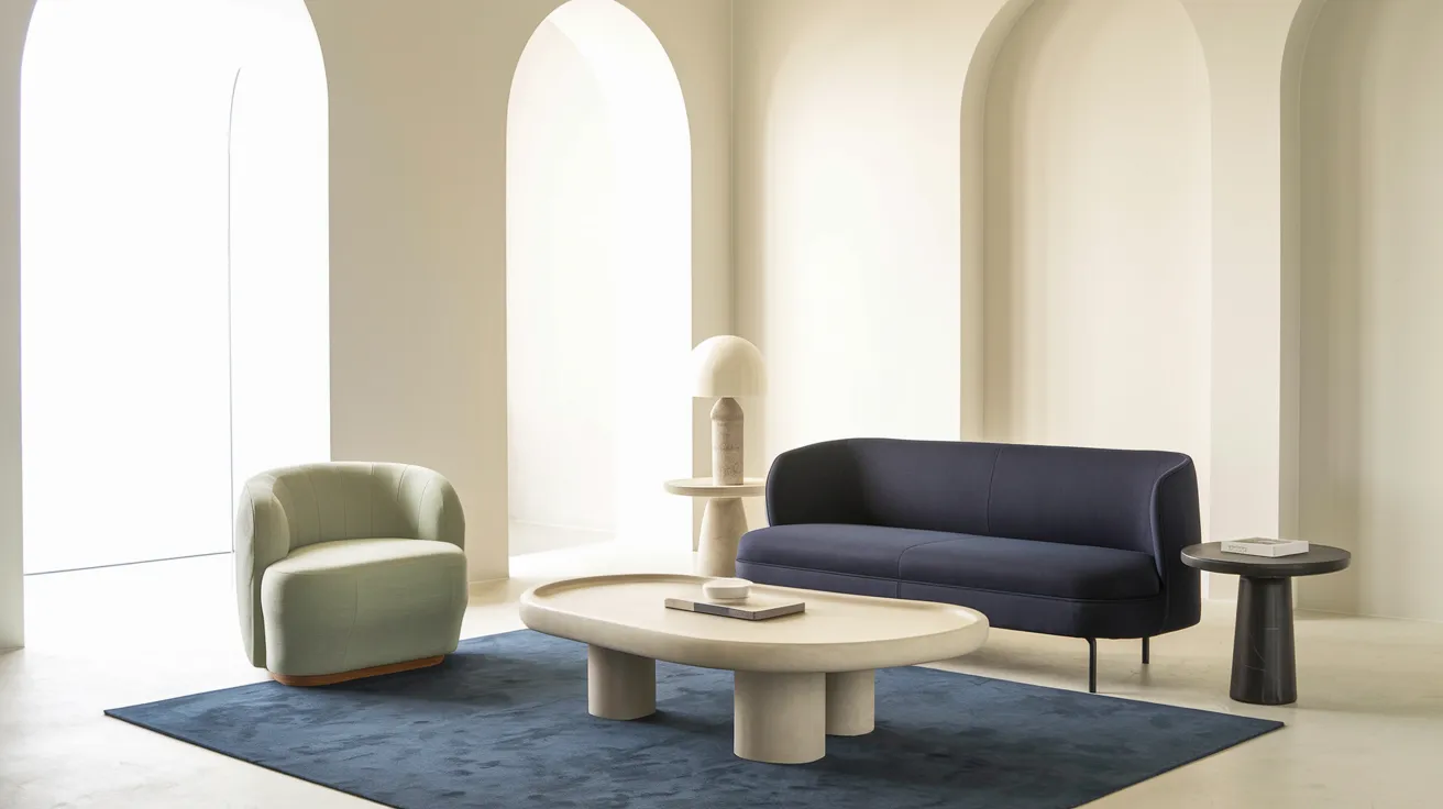
- Navy Blue (Recommendation: Benjamin Moore Hale Navy)
- Sage Green (Recommendation: Benjamin Moore Saybrook Sage)
- Warm Gray (Recommendation: Benjamin Moore Gray Owl)
- Deep Charcoal (Recommendation: Benjamin Moore Wrought Iron)
White Dove Pairings
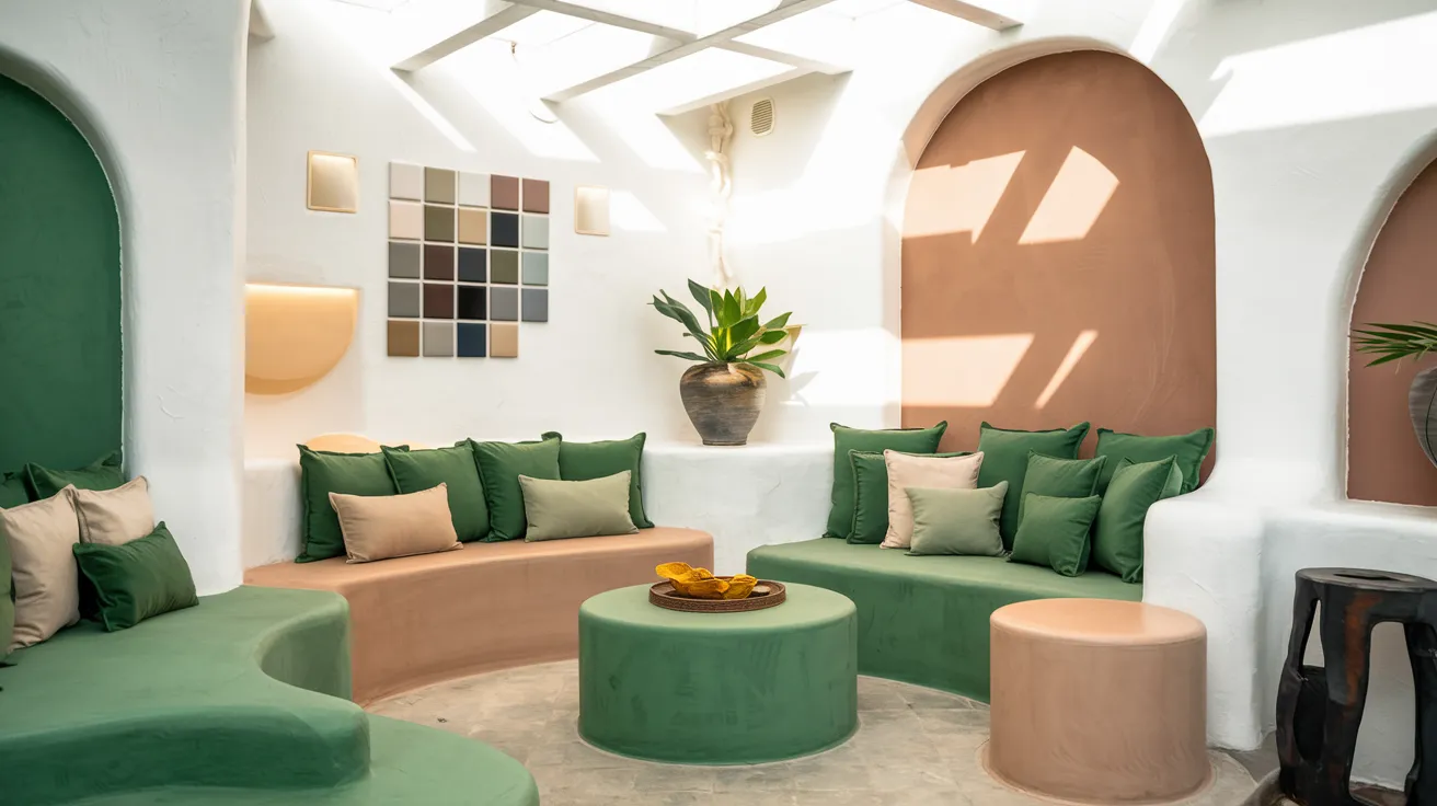
- Deep Green (Recommendation: Benjamin Moore Hunter Green)
- Warm Beige (Recommendation: Benjamin Moore Manchester Tan)
- Soft Black (Recommendation: Benjamin Moore Black Iron)
- Rich Brown (Recommendation: Benjamin Moore Alexandria Beige)
Appearance in Different Lighting
It is important to consider how a white paint color behaves in different lighting. White and White Dove can look quite different depending on the natural light in a room.
Simply White in Natural Light: Simply White looks crisp and clean in well-lit spaces, with the warm undertones softening the brightness.
It can look especially radiant in rooms with a lot of direct sunlight, making them feel even airier.
White Dove in Natural Light: White Dove can appear cooler or more neutral in bright spaces, but it has a way of softening and warming up in the evening or areas with limited natural light.
It creates a calm and cozy environment, especially in rooms with lower light levels.
Key Differences: Simply White and White Dove
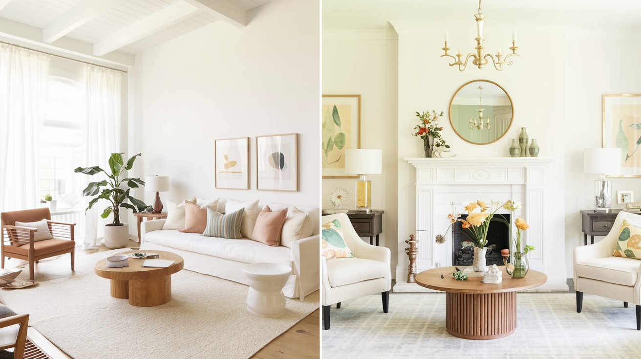
Undertones
One of the key differences between these two colors lies in their undertones.
Simply White has subtle yellow and green tones that lend warmth, while White Dove has muted Gray-Beige undertones that give it a softer, more neutral vibe.
These undertones can significantly impact how the color feels in different lighting conditions.
Simply White: The yellow-green undertones make it feel fresher and livelier. This is ideal if you’re looking for a white that will stand out but still feel cozy and approachable.
White Dove: The soft Greige undertones give it a gentler, quieter feel. It’s perfect for spaces that need a refined touch without being too bold.
Light Reflectance Value (LRV)
Light Reflectance Value (LRV) measures how much light a color reflects.
The higher the LRV, the brighter and airier a room will feel when painted with that color.
Simply White has a higher LRV than White Dove, meaning it will reflect more light and create a brighter atmosphere in a room.
- Simply White has an LRV of about 91, reflecting a significant amount of light, making spaces feel open, fresh, and crisp.
- White Dove has an LRV of around 85, which is still considered light but not as bright as Simply White. The slightly lower LRV gives it a softer, more enveloping vibe.
Simply White vs. White Dove: A Quick Comparison
Here’s a side-by-side overview of the differences between Simply White and White Dove:
Feature | Simply White | White Dove |
Undertones | Soft yellow and green undertones, warm | Soft, greige undertones, neutral and calming |
Light Reflectance Value (LRV) | 91 (bright, crisp, and fresh) | 85 (soft, subdued, and cozy) |
Best for | Kitchens, trim, ceilings, modern spaces, bright rooms | Living rooms, bedrooms, low-light spaces, transitional rooms |
Appearance in Bright Light | Crisp and fresh, brightens the space | Softer, neutral, calming |
Appearance in Low-Light | It can appear slightly washed out in darker rooms | Warm and inviting without feeling dark |
Care and Maintenance Tips
Maintaining your walls, especially with white paint, ensures they stay looking fresh and vibrant.
Regular upkeep prevents dirt buildup and scuff marks while prolonging the life of the paint. These simple practices will help retain the pristine look of your painted surfaces.
Regular Care
- Dust walls monthly with a soft microfiber cloth
- Clean scuff marks immediately using a magic eraser
- Avoid harsh chemicals that can yellow-white paint
Spot Cleaning
- Use a gentle solution of warm water and mild soap
- Test cleaning products on an inconspicuous area first
- Pat dry immediately to prevent watermarks
Long-term Maintenance
- Keep rooms well-ventilated to avoid yellowing
- Touch up high-traffic areas every 18-24 months
- Document your exact paint color and finish for future reference
Conclusion
End of the day, both Simply White and White Dove are excellent choices, depending on the atmosphere you wish to create.
Simply White is bright and fresh, perfect for high-traffic areas like kitchens or hallways.
White Dove, on the other hand, offers a softer, neutral tone ideal for bedrooms and living rooms, creating a calm and cozy ambiance.
Both shades are versatile and timeless, fitting a variety of home styles.
The key is to consider your lighting, desired ambiance, and how the color complements your existing décor to make the best choice for your space.
Frequently Asked Question
Which is Brighter, Simply White or White Dove?
Simply White is brighter, with an LRV of 91. It reflects more light, making it ideal for bright spaces.
Can I Use Simply White for My Walls?
Absolutely! Simply White is perfect for walls in spaces with a lot of natural light. It helps open up a room and creates a fresh feel.
Does White Dove Look Good with Dark Wood Furniture?
Yes! White Dove pairs beautifully with dark wood furniture. The soft, greige undertones complement rich wood tones, creating a refined and balanced look.

