


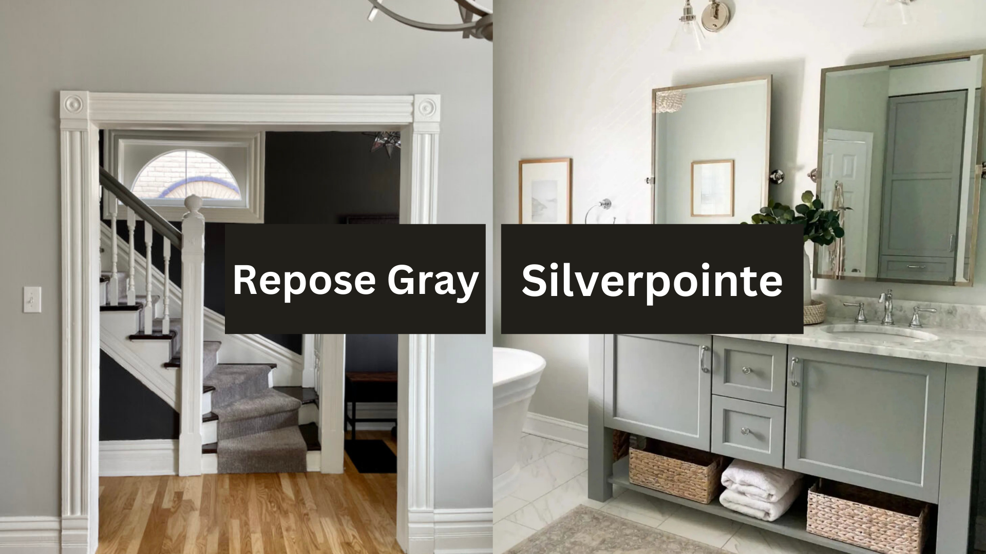
Choosing the perfect gray paint can be overwhelming. Sherwin-Williams offers two exceptional options. Silverpointe and Repose Gray stand out for their versatility.
These grays transform spaces in unique ways, each creating its own distinct atmosphere.
Silverpointe brings cool sophistication with blue undertones, while Repose Gray offers warm elegance with beige notes.
Selecting between them requires careful consideration. Your choice will impact your entire space. This guide compares these popular grays side by side.
We’ll find out how they react to light and examine how they work with different design elements.
By the end, you’ll know which gray suits your home and understand how each color behaves in various conditions. This will help you make the perfect choice for your space.
What Makes Silverpointe and Repose Gray Unique?
Before looking into the differences, let’s first understand what makes these shades special.
Silverpointe: A Cool, Subtle Gray with Blue Undertones

Silverpointe (SW 7653) is a soft, cool gray with a hint of blue.
It’s part of Sherwin Williams’ “Architectural Colors” collection, which is designed to create a refined and serene backdrop.
Silverpointe is known for its light, airy feel and is often described as a cool gray or even a “blue-gray” because of its subtle undertones.
It works well in contemporary, modern, and minimalist spaces where a clean, fresh look is desired.
One of Silverpointe’s standout qualities is its ability to reflect light beautifully. This makes it ideal for rooms that receive a lot of natural sunlight.
It doesn’t overpower the room but enhances the space by making it feel bright and spacious.
Repose Gray: A Warm, Soft Gray with Beige Undertones

Repose Gray (SW 7015), on the other hand, is a more versatile and warmer gray.
It has a strong beige undertone, giving it a slightly brownish or taupe appearance.
This warmth makes it perfect for creating a cozy, welcoming environment in spaces that need a bit of softness.
Unlike Silverpoint, which feels cooler, Repose Gray feels more balanced and inviting, making it a favorite for traditional, rustic, and transitional interiors.
Repose Gray is a great choice for areas where you desire a neutral backdrop, steering clear of the harshness of pure white or the chilliness of a true gray.
It pairs effortlessly with natural materials like wood, stone, and brass, bringing a sense of calm to larger spaces.
Key Differences Between Silverpointe and Repose Gray
The most significant difference between Silverpointe and Repose Gray lies in their undertones and the atmosphere they create in a room. Let’s break it down further.
Undertones and Temperature: Cool vs. Warm
| Feature | Silverpointe | Repose Gray |
|---|---|---|
| Undertones | Cool blue and green undertones | Warm beige and taupe undertones |
| Temperature | Cool, fresh, and crisp | Warm, inviting, and cozy |
| Best Suited For | Modern, minimalist spaces seeking a clean, sleek look | Living rooms, bedrooms, and areas that need a cozy backdrop |
| Impact in Low Light | It may appear stark or cold in dimly lit areas | Provides warmth and comfort, even in low-light environments |
| Ideal Design Style | Contemporary, modern, and minimalistic | Traditional, transitional, and rustic designs |
Light Reflectance: How Lighting Affects Both Colors
Another important factor to consider is lighting, which can significantly impact the color’s appearance.
Natural and artificial light can shift these colors, so understanding their light reflectance is key.
Silverpointe has an LRV (Light Reflectance Value) of 60. This is considered a light to medium color, which means it will reflect a decent amount of light, brightening up a space.
However, because of its cooler undertones, Silverpointe may appear more muted or cold in rooms lacking ample natural light. In a sunlit room, however, it will feel bright and airy.
Repose Gray, with an LRV of 58, is slightly darker but still falls within the light gray range. It has enough warmth to look inviting in both natural and artificial lighting.
In a room with natural light, Repose Gray will feel soft and neutral, while in artificial lighting, the beige undertones will come forward, creating a cozy, calm atmosphere.
Ideal Spaces for Silverpointe and Repose Gray

The ideal space for each color depends on the mood you want to create and the amount of natural light your room receives.
Silverpointe is perfect for rooms that receive a lot of natural light.
Its cool, reflective nature makes it a great option for living rooms, dining rooms, and entryways where you want to create a bright, clean, modern feel.
However, it may not be suitable for rooms with limited natural light, as it can seem cold and uninviting.
With its warm, neutral undertones, Repose Gray works well in bedrooms, kitchens, and bathrooms, especially if you want to create a comfortable, balanced atmosphere.
It’s also great for larger spaces like open-concept living rooms where you want to maintain a warm, inviting vibe without the room feeling too dark.
Because it works well with warm and cool tones, it can complement various interior styles, from traditional to modern.
Which Color Should You Choose? Silverpointe or Repose Gray?
Now that we’ve discussed their differences, how do you decide which is the right choice for your home?
Here are some tips to help you choose between Silverpointe and Repose Gray.
Choose Silverpointe if:
- You have a modern, minimalist, or contemporary home.
- You want a cooler, fresher vibe in rooms with plenty of natural light.
- You prefer a light, airy feel in living or dining rooms.
- You’re looking for a color that pairs well with white, silver, or cool tones in your furniture and décor.
Choose Repose Gray if:
- You want a warmer, inviting color for living rooms or bedrooms.
- You have warm lighting or want to balance out the cooler aspects of your home’s design.
- You prefer a neutral color that works well with light and dark furniture.
- You’re designing a traditional or transitional space with natural elements like wood or stone.
Lighting and Silverpointe vs. Repose Gray
The lighting in a room plays a huge role in how each of these shades looks.
For example:
Silverpointe in Natural Light: The blue undertones in Silverpointe come forward when the room is filled with natural light.
It will appear cooler and fresher, making it an excellent choice for sun-filled rooms or open spaces where you want to create a sense of airiness.
Repose Gray in Natural Light: In rooms with plenty of natural light, Repose Gray’s beige undertones soften the space, making it feel cozy but still neutral.
It works wonderfully in spaces like living rooms or kitchens where you want to avoid the starkness of white.
Styling Guide: Decorating with Gray Walls

Furniture Pairings
When decorating with gray walls, the right furniture can make or break the look.
For Silverpointe, cool gray, modern white, or light oak furniture fits perfectly.
Add depth with navy or charcoal accents and complement with glass or chrome finishes. Avoid dark brown woods, as they clash with Silverpointe’s cooler tones.
For Repose Gray, warm gray, dark wood furniture pairs beautifully.
Softening with cream or beige upholstery, mix brass or bronze metals for sophistication.
Natural wood tones bring warmth and balance to the space.
Flooring Materials
To complement Silverpointe’s cool tones, opt for light oak hardwood, white marble, cool-toned luxury vinyl, or light gray carpet.
For Repose Gray’s warm undertones, go with medium to dark hardwoods, warm stone tiles, beige or taupe carpet, or rustic wood-look flooring.
Window Treatments
For Silverpointe, white sheer curtains provide an airy, light atmosphere. Crisp Roman shades add structure, while navy or charcoal drapes bring contrast.
Modern cellular blinds ensure privacy and light control, making it ideal for contemporary spaces.
Repose Gray pairs well with natural linen curtains for warmth and texture.
Woven wood blinds offer an earthy vibe, while cream Roman shades and textured neutral drapes add depth.
These treatments enhance the color’s warmth, creating a cozy atmosphere for traditional or relaxed interiors.
Art and Decor
Black and white photography, abstract blue or silver art, chrome accessories, and white ceramics perfectly suit Silverpointe’s cool undertones.
Repose Gray pairs well with botanical prints, warm landscapes, brass or copper accents, and natural woven baskets, enhancing its cozy, warm ambiance.
Common Mistakes to Avoid
Undertone Mismatching
Mixing cool Silverpointe with warm-toned furniture can create a clash. Place large paint samples next to existing furnishings to see how the colors interact.
When choosing a paint color, always consider the undertones of fixed elements like countertops, tiles, and flooring.
Sample Testing Errors
Tiny paint chips can lead to inaccurate results. Use large sample boards (at least 2′ x 2′) and test them in different lighting conditions throughout the day.
Always test over white primer to avoid interference from existing colors.
Application Mishaps
Skipping proper wall preparation is a common mistake. Clean, repair, and prime the walls before painting, and be sure to fill any holes.
Plan for two full coats of paint, even with premium paint, to ensure consistent coverage. Maintain a wet edge while painting.
Tool Selection
Using low-quality brushes and rollers can result in poor paint application.
To get the best finish, invest in professional-grade tools and use the right roller nap for your wall texture.
Environmental Factors
Painting in extreme temperatures or high humidity can affect the paint’s drying time and final appearance.
Paint when the temperature is between 50-85°F and avoid painting in high humidity conditions.
By avoiding these common mistakes and following the styling guidelines, you’ll achieve the best possible results with either Silverpointe or Repose Gray.
Remember that planning and testing properly will save time and money in the long run.
Conclusion
Choosing between Silverpointe (SW 7653) and Repose Gray (SW 7015) depends on the feel you want to create in your space.
Silverpointe brings a cool, fresh tone ideal for modern or minimalist designs, especially in areas with ample natural light.
Conversely, Repose Gray offers a warmer, softer feel, making it perfect for traditional or cozy spaces.
Lighting will influence each shade’s appearance, so testing samples in your home is recommended.
Both colors are flexible, allowing you to raise the beauty and atmosphere of your home effortlessly.
Whichever you choose, you’ll enjoy the calm and welcoming ambiance they bring to your rooms.
Frequently Asked Question
Can Silverpointe and Repose Gray Be Used Together?
Yes, they can. Silverpointe’s cool tones complement Repose Gray’s warm shades, making them work well together in the same room.
Which Paint is Better for High-Traffic Areas?
Both are durable, but Silverpointe’s lighter color may show dirt and scuffs more easily. Repose Gray’s warmer tones may hide marks better.