


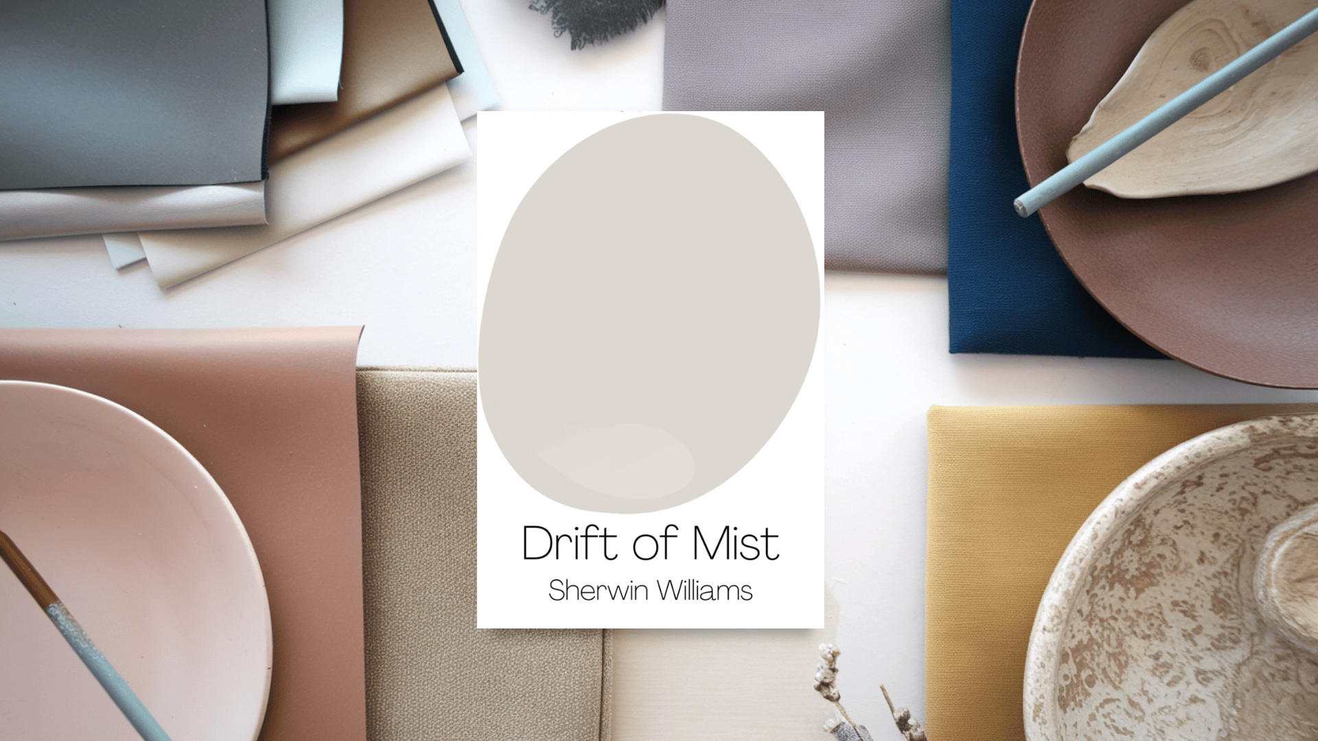
Choosing the perfect neutral paint color can be tricky, but Sherwin-Williams Drift of Mist (SW 9166) is a great option for those who want a soft, airy look.
It’s neutral enough to fit any style, making it a favorite among homeowners, interior designers, and home stagers.
Why Drift of Mist is a Great Choice:
- Light and airy: Keeps rooms feeling open and fresh.
- Versatile: Pairs well with many colors and design styles.
- Adapts to lighting: Looks warmer in some spaces and cooler in others.
- Timeless and elegant: A classic choice that won’t go out of style.
If you’re looking for a soft, neutral paint that’s not too dark or light and works almost anywhere, Drift of Mist might be the perfect fit!
Understanding Drift of Mist’s Color Profile

Before choosing a paint color, it’s helpful to understand its undertones, brightness, and how it changes in different lighting.
Let’s break down what makes Sherwin-Williams Drift of Mist (SW 9166) unique.
Color Details: Hex Code & RGB Values
For those who need a digital color reference, Drift of Mist’s Hex Code is #DAD7CD.
Its RGB values (which define the amount of red, green, and blue in the color) are 218, 215, and 205.
This means it has a soft, muted tone that isn’t too bold or overpowering.
How Bright is Drift of Mist?
LRV (Light Reflectance Value) measures how much light a color reflects. The scale runs from 0 (pure black) to 100 (pure white).
- Drift of Mist has an LRV of 69, which means it’s a light color, close to an off-white.
- It may appear even lighter in bright, sunlit rooms and sometimes look washed out.
- It may seem dull or shadowy in darker rooms, so good lighting is important.
Undertones & Color Family
Drift of Mist is officially in the Yellow Hue family, which leans slightly warm.
Some people notice subtle green undertones, especially in rooms with cool lighting or when paired with certain colors.
In different lighting and surroundings, it can look warmer or cooler.
How Lighting Changes Its Appearance
- In natural daylight: Looks like a soft, neutral greige.
- In north-facing rooms: May appear cooler, with a slight grayish-green tint.
- In south-facing rooms: Feels warmer, with more beige showing through.
- With warm artificial lighting: Looks cozy and inviting.
- With cool LED lights: Can lean a bit gray.
Because lighting and nearby colors affect how Drift of Mist looks, it’s always a good idea to test a sample in your space before painting an entire room.
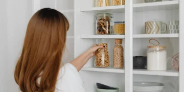
Where to Use Drift of Mist in Your Home
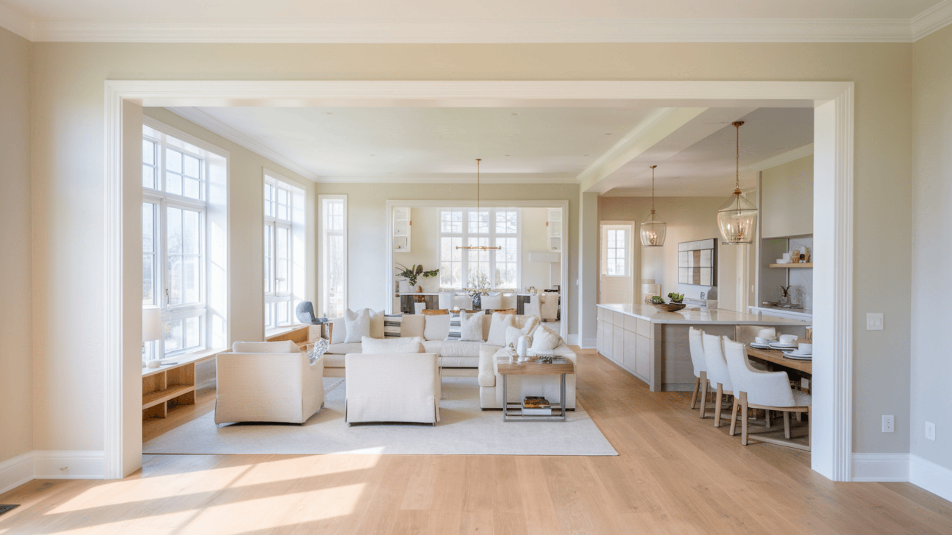
Drift of Mist is a soft, neutral color that works well in almost any room.
Its light and airy feel makes spaces look fresh and inviting, and its balanced mix of warm and cool tones makes it easily blend with different styles and materials.
Here’s how you can use it in different areas of your home:
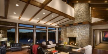
Living Room
Drift of Mist is a great choice for living rooms because it creates a warm, welcoming feel without being too bold.
It works well with modern and traditional décor, making it easy to pair with furniture, rugs, and accent colors.
Add white trim and soft-colored furnishings for a clean, timeless look.
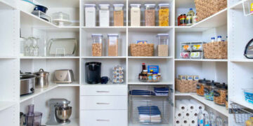
Kitchen
This color works beautifully in kitchens with white, wood, or gray cabinets.
It provides a light and fresh backdrop, making the space feel open and airy.
It also complements stainless steel appliances, marble countertops, and subway tile backsplashes.
Bedrooms
For a relaxing bedroom, Drift of Mist is a perfect choice.
Its soft, neutral tones create a peaceful atmosphere that complements warm wood furniture, upholstered headboards, and layered bedding.
This color adapts beautifully for a modern, minimalist feel or a cozy, farmhouse-style retreat.
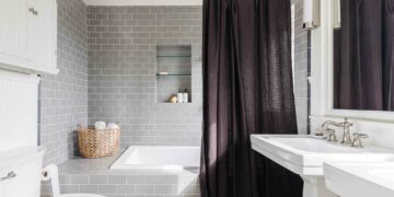
Bathrooms: Works with Natural Finishes
Drift of Mist pairs beautifully with white accents and natural stone, making it a great bathroom option.
It complements marble, quartz, and light wood vanities, creating a spa-like, clean, and soothing environment.
To complete the look, add warm lighting and soft towels.
Hallways & Open Spaces: Seamless & Versatile
If you want a color that flows smoothly throughout your home, Drift of Mist is an excellent choice for hallways and open floor plans.
Its light reflectance (LRV 69) helps keep spaces bright and airy, and it blends well with different wall art, flooring types, and furniture styles.
Drift of Mist in Different Lighting

Like most neutral paint colors, Drift of Mist SW 9166 changes depending on the lighting in a room.
Its undertones and warmth can shift throughout the day, so it’s important to test it in your space before painting.
Here’s how it behaves in different lighting conditions:
North-Facing Rooms
Rooms with north-facing windows get less direct sunlight and tend to have cooler, bluish natural light.
Drift of Mist may appear grayer or slightly greenish in these spaces.
If you prefer a warmer look, pair it with warm lighting, beige décor, or wood accents to balance the coolness.
South-Facing Rooms
South-facing rooms get plenty of natural light throughout the day, making colors look warmer and brighter.
In these rooms, Drift of Mist will lean more beige and feel soft and inviting.
This makes it a great choice for living rooms, kitchens, and open spaces with lots of sunlight.
East-Facing Rooms
Morning sunlight gives east-facing rooms a warm and bright glow, making Drift of Mist feel light and airy.
However, as the sun moves, the room will get less natural light, and Drift of Mist may look slightly cooler and more muted in the afternoon and evening.
West-Facing Rooms
West-facing rooms start the day with less sunlight, so Drift of Mist may appear cooler in the morning.
But as the sun sets, the warm, golden light will make it feel cozier and richer.
This makes it a great color choice for bedrooms or dining rooms with a lot of evening light.
Impact of Artificial Lighting on Drift of Mist
Artificial lighting also affects how this color appears. The type of bulbs you use can enhance or change its warmth:
- Warm White Bulbs (2700K-3000K): Bring out Drift of Mist’s beige undertones, making it feel cozier and more inviting.
- Cool White Bulbs (4000K-5000K): This can make the color appear grayer and cooler, especially in rooms with less natural light.
- Daylight Bulbs (5000K-6500K): Give the most true-to-color appearance but may make Drift of Mist feel a bit washed out.
Tip: To maintain Drift of Mist’s soft, balanced look, choose warm white LED bulbs for a natural, welcoming glow.
Best White Trim Colors to Pair with Drift of Mist
Choosing the right white trim color can greatly affect how Drift of Mist SW 9166 looks in your home.
The best white depends on your overall style—crisp and modern, soft and subtle, or warm and traditional.
Here are three great options:
1. Sherwin-Williams High Reflective White (SW 7757)

High Reflective White (SW 7757) is the best choice if you want a bright, clean contrast.
It’s the brightest white in Sherwin-Williams’ collection, making Drift of Mist stand out as a soft, airy gray-beige.
This works well in modern and contemporary spaces where you want a fresh, high-contrast look.
Best for:
- Modern, minimalist homes
- Pairing with cool grays and crisp colors
- High-contrast trim and ceilings
2. Sherwin-Williams Pure White (SW 7005)

Pure White (SW 7005) is a great option if you prefer a less stark white that still looks clean.
It has a touch of warmth, which helps it blend seamlessly with Drift of Mist.
This is perfect for trim, doors, and ceilings if you want a soft, classic look that doesn’t feel too harsh.
Best for:
- Transitional and farmhouse styles
- Keeping the trim from looking too stark
- A subtle, clean look with Drift of Mist
3. Sherwin-Williams Alabaster (SW 7008)

Alabaster (SW 7008) is a beautiful choice for a softer, creamier feel.
Its warm undertone enhances the warmth in Drift of Mist, making it feel cozy and inviting.
If you love traditional, rustic, or vintage-inspired spaces, this is a great option for trim, cabinets, and moldings.
Best for:
- Traditional and farmhouse designs
- Creating a warm, inviting space
- Pairing with warm wood tones
Coordinating Colors & Design Schemes
Drift of Mist is a soft, neutral shade that beautifully complements various colors.
Many great options exist for a subtle, monochromatic look or a bold contrast.
Here are some of this color’s best neutral pairings, contrast colors, and accent shades.
1. Neutral Pairings: Soft & Seamless
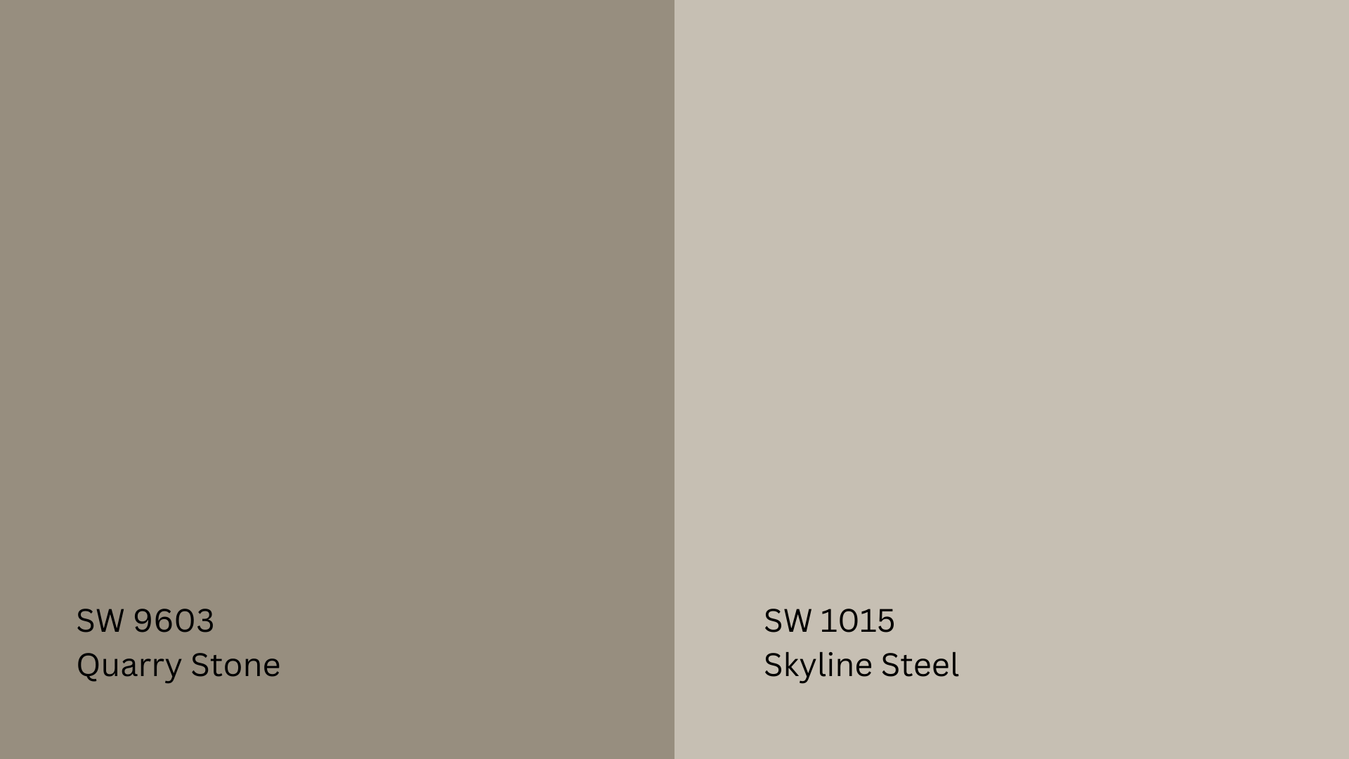
If you’re looking for a calm, harmonious palette, these neutrals work well with Drift of Mist:
- Quarry Stone (SW 9603): A soft, earthy gray that adds warmth without overpowering the space.
- Skyline Steel (SW 1015): A light, balanced gray that blends seamlessly with Drift of Mist for a cohesive, sophisticated look.
Best for: Open floor plans, whole-house color schemes, and minimalist interiors.
2. Darker Contrast Colors: Bold & Striking
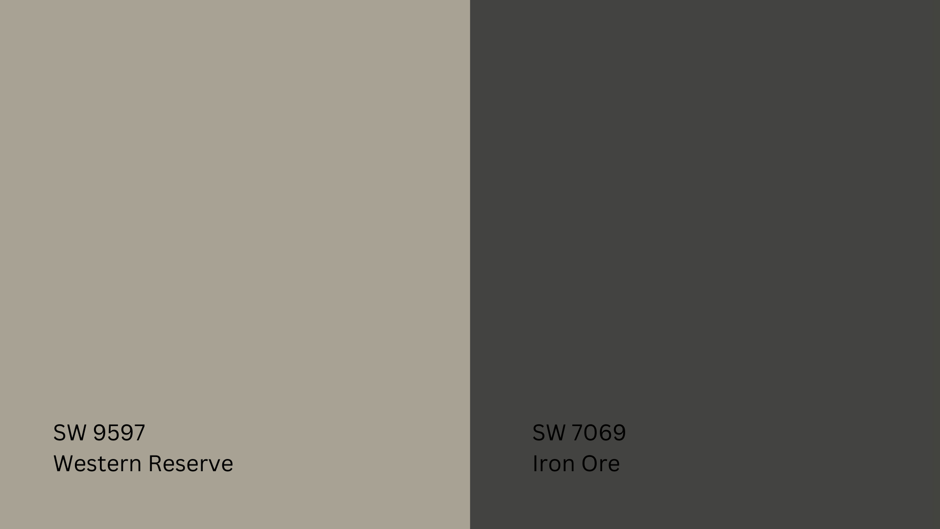
If you want to add depth and drama, try pairing Drift of Mist with darker shades:
- Western Reserve (SW 9597): A deep, earthy brown-gray that creates a rich, grounding contrast.
- Iron Ore (SW 7069): A nearly black charcoal shade that provides a modern, bold contrast against Drift of Mist.
Best for: Feature walls, cabinets, doors, and furniture pieces for added depth.
3. Soft, Earthy Complements: Warm & Natural
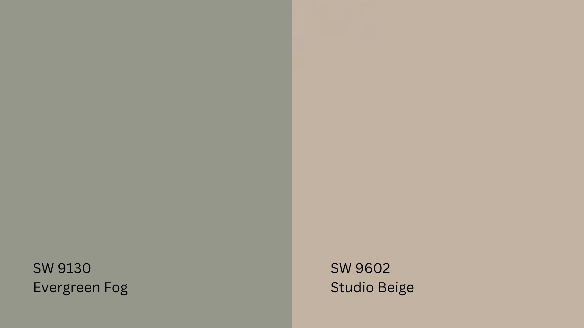
For a nature-inspired, cozy feel, these colors work beautifully with Drift of Mist:
- Studio Beige (SW 9602): A warm, light beige that enhances the soft, inviting feel of Drift of Mist.
- Evergreen Fog (SW 9130): A gentle, muted green that adds a refreshing, organic touch.
Best for: Bedrooms, kitchens, and cozy living spaces with warm wood tones and natural materials.
Best Accent Colors: Rich & Elegant
If you want to add pops of color to your space, try these accent shades:
- Deep Navy: Adds a sophisticated, classic touch (great for furniture or wall décor).
- Forest Green: A grounding, earthy shade that pairs well with Drift of Mist’s subtle green undertones.
- Warm Taupe: Brings out the warmth in Drift of Mist for a cozy, layered look.
Best for: Throw pillows, rugs, curtains, artwork, and accent walls.
Drift of Mist vs. Other Popular Neutrals
Choosing between different neutral paint colors can be tough since they all have slight variations in tone, warmth, and brightness.
Here’s how Drift of Mist (SW 9166) compares to some of Sherwin-Williams’ other top neutrals.
Drift of Mist vs. Agreeable Gray (SW 7029)
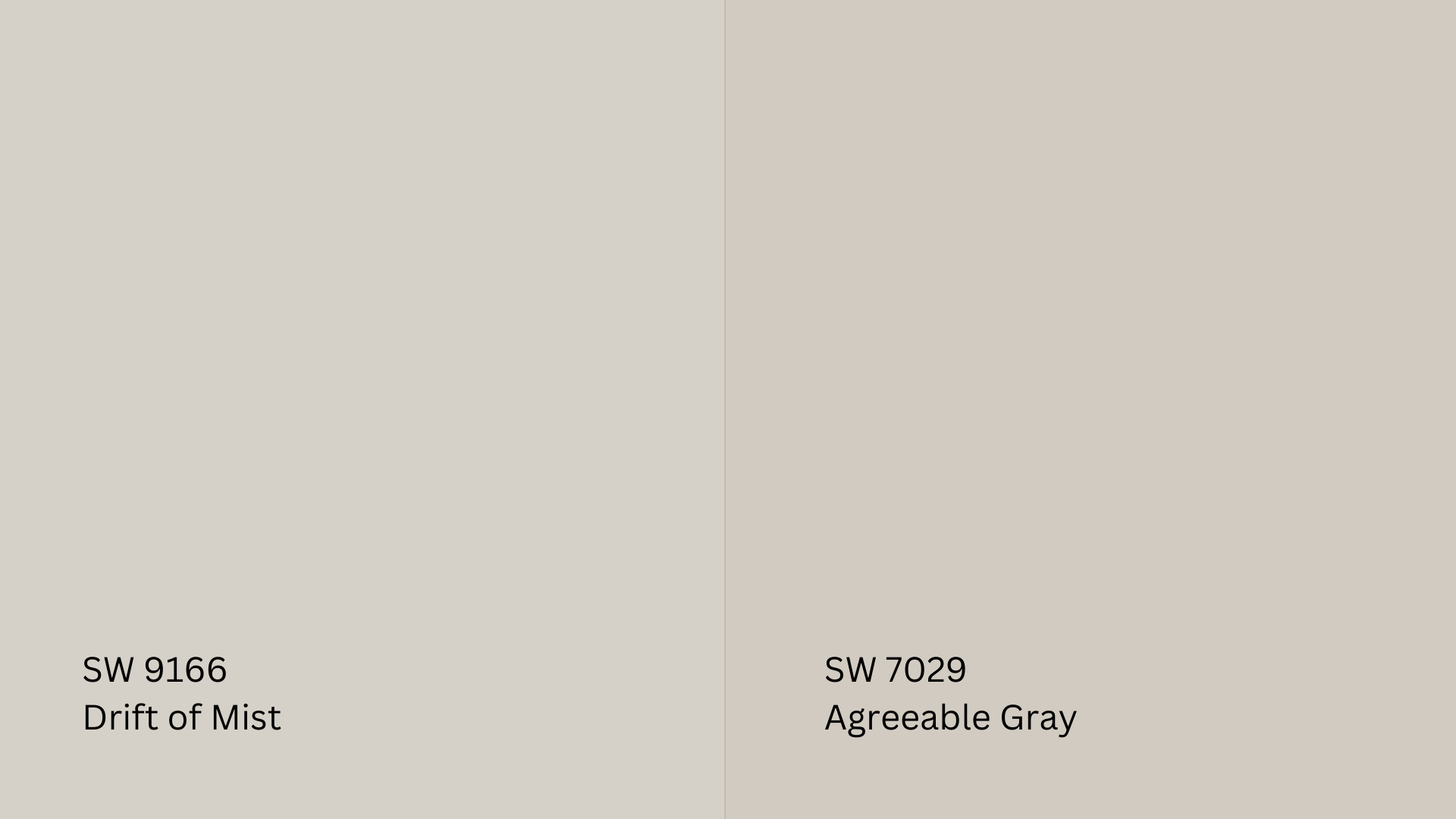
- Agreeable Gray (SW 7029) is darker and warmer than Drift of Mist.
- It has a stronger beige undertone, making it a true greige (gray + beige).
- Best for rooms with lots of natural light because its deeper tone holds up better.
- Drift of Mist is lighter and softer, making it a great choice for those who want a subtle gray with a hint of warmth.
Choose Agreeable Gray if you want a richer greige that works well in bright spaces.
Choose Drift of Mist if you want a lighter, softer neutral that feels airy.
Drift of Mist vs. Gossamer Veil (SW 9165)
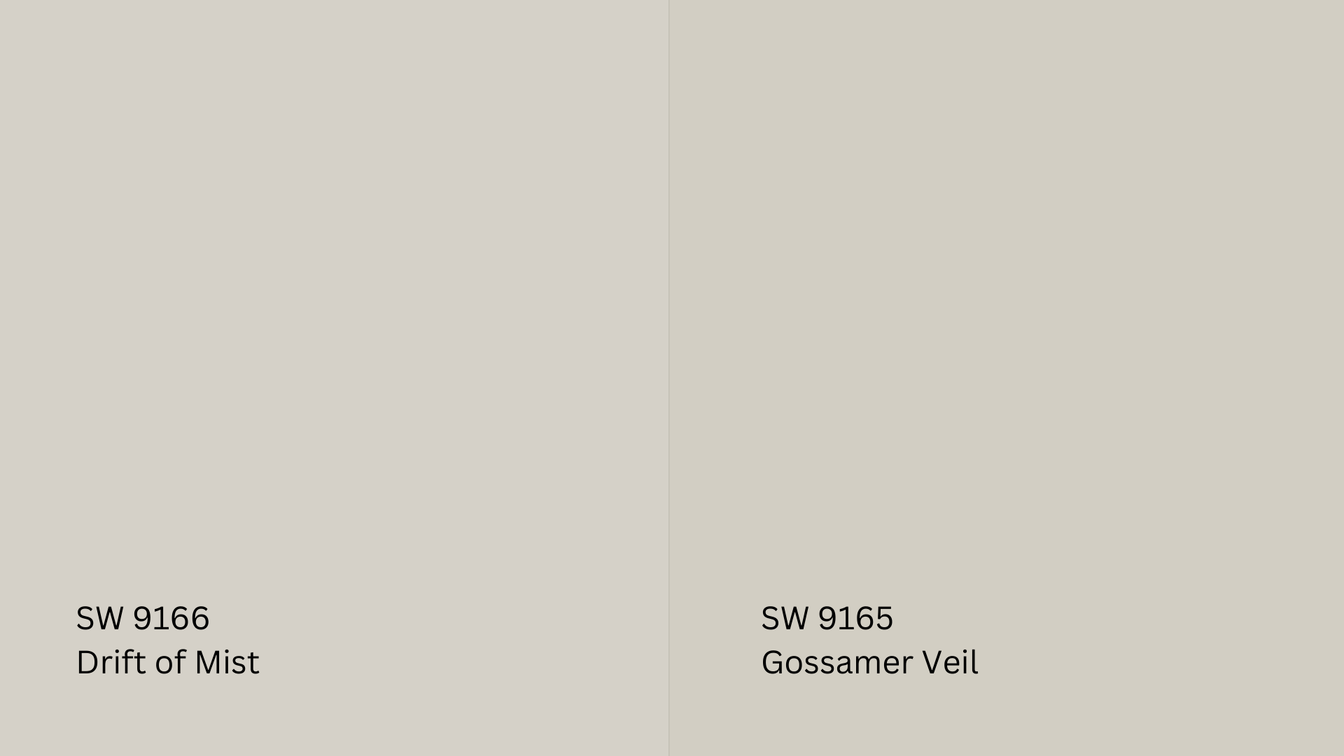
- Gossamer Veil (SW 9165) is slightly darker and warmer than Drift of Mist.
- It has a touch more beige, making it feel a bit cozier in most spaces.
- It works better in bright, well-lit rooms, as its deeper tone holds up well in direct sunlight.
- Drift of Mist is lighter and more muted, making it better suited for low-light areas where a soft, airy feel is desired.
Choose Gossamer Veil if you prefer a warmer neutral with more depth.
Choose Drift of Mist if you want a lighter and more subtle gray.
Drift of Mist vs. City Loft (SW 7631)
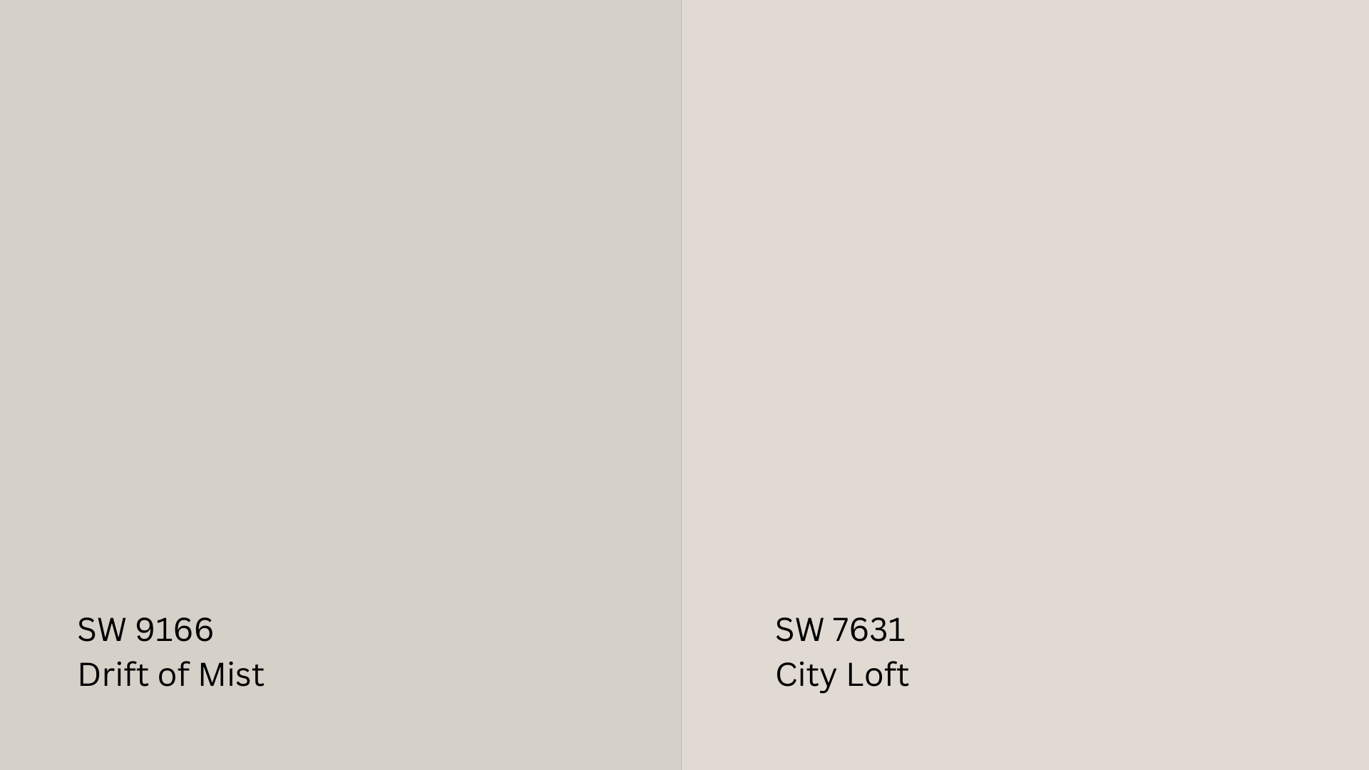
- City Loft (SW 7631) is warmer than Drift of Mist, with subtle pink-beige undertones.
- It has a slightly lower LRV (reflects a little less light), so it feels deeper in tone.
- Drift of Mist is more neutral, while City Loft leans into a warm, blush-toned greige.
Choose City Loft if you like a soft, warm beige-gray with a hint of pink.
Choose Drift of Mist if you want a cooler, more neutral greige that adapts to lighting.
Drift of Mist vs. Shoji White (SW 7042)
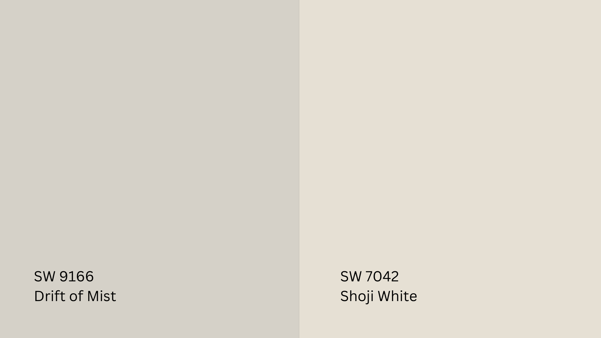
- Shoji White (SW 7042) is closer to an off-white and has a warmer, creamy tone.
- It has a stronger beige/yellow undertone, making it feel cozier than Drift of Mist.
- Drift of Mist is more of a soft gray beige, while Shoji White leans toward a warm, light tan.
Choose Shoji White if you want a warm, off-white neutral that feels inviting.
Choose Drift of Mist if you prefer a cooler, more subtle greige that doesn’t lean too warm.
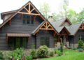
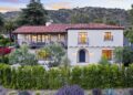
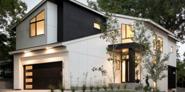
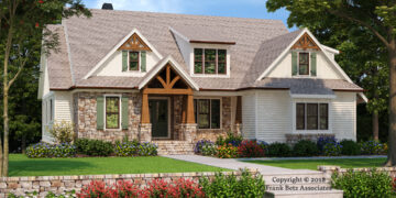
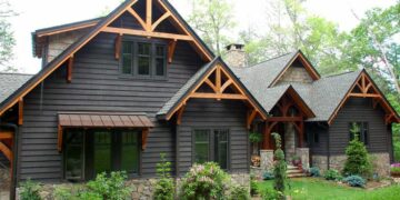
Is Drift of Mist a Good Exterior Color?

Drift of Mist can be an exterior color, depending on your home’s lighting and surroundings.
Since it’s a soft, light neutral with an LRV of 69, it can look bright and airy in some settings but washed out in others.
Pros of Using Drift of Mist on Exteriors
- Soft and neutral: A great choice for homeowners who want a subtle, modern look.
- Pairs well with dark trim: Looks stunning with bold colors like charcoal, black, or navy for contrast.
- A great alternative to stark white: Drift of Mist offers a softer, more sophisticated option if bright white feels too harsh.
Cons of Using Drift of Mist on Exteriors
- It may look washed out in bright sunlight. Because of its high LRV, it reflects a lot of light and can appear almost white.
- It can feel too light in open outdoor spaces. If your home gets full sun, you may want a color with more depth to prevent it from looking faded.
Best Exterior Trim Pairings
Pairing Drift of Mist with the right trim color can help balance its brightness:
- Black Fox (SW 7020): A deep, almost-black brown that creates a bold, modern contrast.
- Pure White (SW 7005): A classic, clean white that keeps the look crisp and timeless.
Other great trim options:
- Iron Ore (SW 7069): A deep charcoal for a striking contrast.
- Shoji White (SW 7042): A warm, creamy white for a softer, blended look.
Alternative Exterior Colors
If you like Drift of Mist but worry about it being too pale outdoors, consider these slightly deeper shades:
- Gossamer Veil (SW 9165): A similar greige but richer and warmer for better depth.
- Repose Gray (SW 7015): A darker, slightly cooler gray that holds up well in bright light.
- Anew Gray (SW 7030): A warmer greige with more beige for added richness.
Choose and Test Drift of Mist in Your Home

Testing it in your space is important before committing to Drift of Mist SW 9166.
Lighting, décor, and surrounding colors can change how it appears, so sampling first can prevent surprises.
Why You Should Always Sample First
- Lighting affects color: Drift of Mist can look warmer or cooler depending on whether your room has natural or artificial light.
- Surrounding décor matters: The color may pick up undertones from furniture, flooring, or countertops.
- Different times of day, different looks: Morning light, afternoon sun, and evening shadows can all change how the paint appears.
How to Test Properly
- Use large swatches: Instead of tiny paint chips, paint a large sample (at least 12×12 inches) on a white poster board.
- Move it around: Tape the sample on different walls to see how light and shadows affect it.
- Check it at different times of day: Observe the color in morning, afternoon, and evening light.
- Compare it with flooring, furniture, and cabinetry: Make sure it complements your existing wood tones, countertops, and décor.
Mistakes to Avoid
- Relying only on online photos: Colors can look very different on a screen versus in real life.
- Skipping a test in your space: Paint colors change based on surroundings, so what looks good in one home may not be in another.
- Ignoring undertones in your home’s design: If your flooring or countertops have strong yellow, red, or green tones, they may affect how Drift of Mist appears.
Tips from Interior Designers

Drift of Mist SW 9166 is a favorite among home stagers and interior designers because it’s light, neutral, and versatile.
It creates a fresh, inviting atmosphere while adapting to different styles and lighting conditions.
Here’s why professionals love this shade—and how to style it in your home.
Why Designers & Home Stagers Love Drift of Mist
It’s perfect for home staging.
Its soft, neutral color appeals to buyers because it works with almost any décor.
Doesn’t feel too cold or warm: Unlike some grays that feel too icy or beiges that feel too yellow, Drift of Mist sits in a perfectly balanced middle ground.
Pairs beautifully with many styles: Works with modern, farmhouse, traditional, and minimalist interiors.
Its high LRV (Light Reflectance Value of 69) helps open up small spaces and make them feel larger, creating a bright, airy feel.
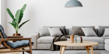
Best Furniture & Décor Styles to Complement Drift of Mist

Drift of Mist is a chameleon color, meaning it can take on different personalities depending on how you style it.
Here are the best design styles that work well with this shade:
- Scandinavian Style: Pair light wood furniture, white accents, and cozy textures for a clean and minimal look.
- Modern Farmhouse: For a rustic yet modern vibe, Complement with warm wood tones, black metal fixtures, and soft white trim.
- Transitional Style: For a timeless feel, Mix classic and contemporary elements with neutral furniture, soft blues, and warm taupes.
- Minimalist & Contemporary: Keep it sleek with simple furniture, monochrome accents, and bold contrast pieces like black or deep navy.
- Coastal Chic: Add soft blues, light grays, and woven textures to enhance Drift of Mist’s airy, breezy feel.
- Drift of Mist with Different Flooring Types
Your flooring color and material can change how Drift of Mist appears in a room.
Here’s how to pair it with different types of flooring:
- Light Hardwood (Oak, Maple, Ash): Enhances Drift of Mist’s soft, airy feel, keeping the space bright and neutral.
- Dark Hardwood (Walnut, Mahogany, Espresso): Creates a beautiful contrast that makes Drift of Mist appear lighter and fresher.
- Gray-toned flooring (LVP, Tile, Concrete): Works well, but test first. Some cool-toned grays may make Drift of Mist appear warmer in contrast.
- Warm Beige or Tan Tiles: Complements Drift of Mist’s undertones, making the space cozy and inviting.
- White or Off-White Flooring: Keeps the space light and seamless, perfect for modern and minimalist designs.
If your flooring has strong undertones (yellow, red, or cool gray), test Drift of Mist next to it first. This ensures the colors work well together in your space.
Conclusion
Sherwin-Williams Drift of Mist SW 9166 is a beautifully balanced gray that works well in various spaces.
Its versatility makes it a great choice for homeowners, designers, and stagers looking for a neutral backdrop that adapts to different lighting and décor styles.
It provides a timeless and elegant look when used in living rooms, kitchens, bedrooms, or exteriors.
However, as with any paint color, testing it in your space before committing is essential, as lighting and surrounding elements can influence its appearance.
Check our other paint color reviews for more insights and inspiration if you found this guide helpful.
Read our blogs for detailed comparisons, coordinating palettes, and design tips to help you find the perfect color for your home!