


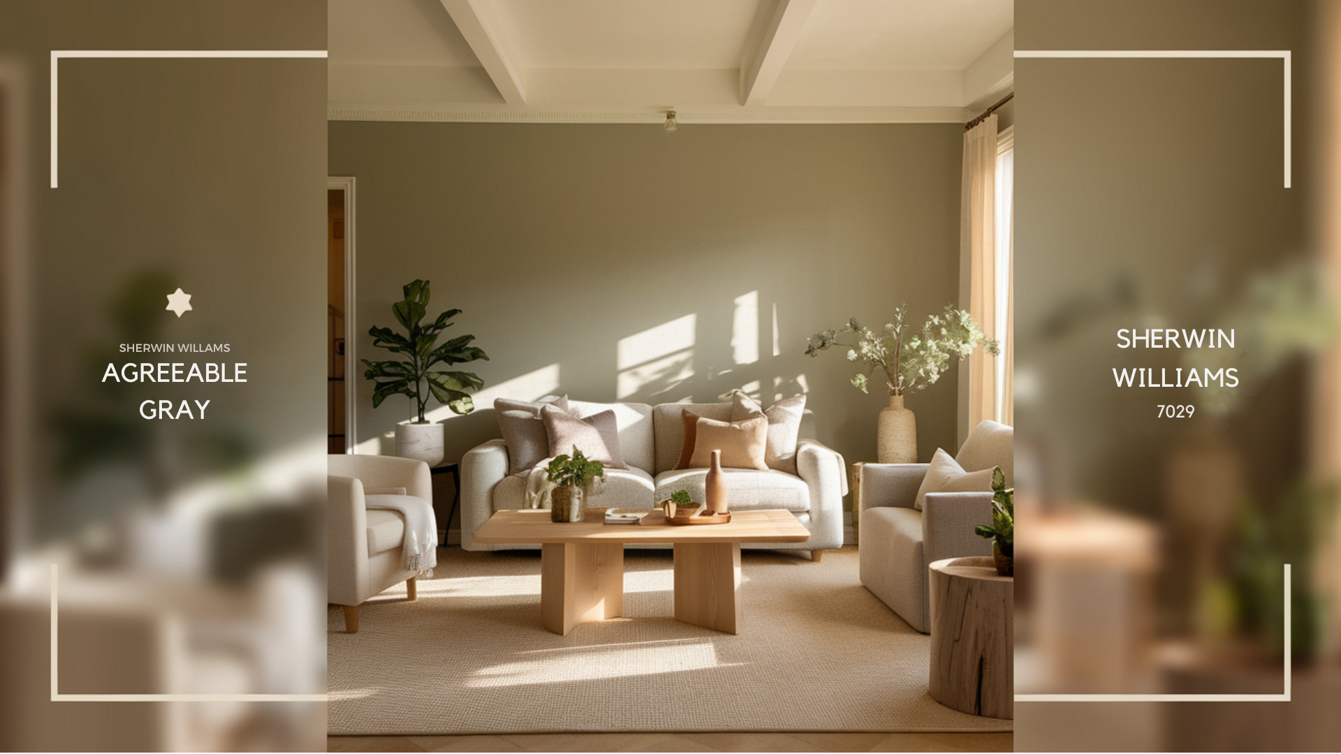
Sherwin Williams Agreeable Gray (SW 7029) has become one of the most popular gray paint colors, and for good reason.
This gentle neutral sits right in the sweet spot between gray and beige, making it a top choice for homeowners and designers alike.
If you’re thinking about using Agreeable Gray in your home, you probably have questions about how warm it looks, what colors hide beneath its surface, and where it works best.
Let’s talk about everything you need to know about this versatile paint color to help you make the right choice for your space.
What is Sherwin Williams Agreeable Gray?

Agreeable Gray (SW 7029) is a paint color that blends the best of gray and beige to create what many call “greige.”
This mix gives you a softer look than a pure gray but keeps things more modern than a traditional beige.
A Warm Take on Gray
Most people call Agreeable Gray a warm gray because it has those cozy beige notes mixed in.
It doesn’t feel cold or stark like some grays can.
Instead, it adds a gentle warmth that makes rooms feel welcoming and comfortable.
A Go-To Color Choice
Agreeable Gray has become a favorite for both inside and outside homes.
Painters and homeowners pick it because it’s easy to work with and matches almost any style.
It works just as well in modern homes as it does in traditional spaces, and it looks good in any room or on exterior walls.
Is Agreeable Gray Warm or Cool?

Like many paint colors, Agreeable Gray changes its mood depending on the light.
While it’s generally considered a warm color, it can show different sides of itself throughout the day and in different spaces.
Warm Undertones of Agreeable Gray
When you look at Agreeable Gray, you’ll notice it’s not your typical gray. It carries warm beige undertones that give it a cozy feel.
In sunny rooms, these warm qualities really shine through.
You might see it lean more toward a soft taupe, especially during golden hour when the sun is setting.
Does Agreeable Gray Ever Look Cool?
Yes- this paint color can shift its personality based on your room’s lighting.
In north-facing rooms, it might show its cooler side. Different times of day can also change how it looks – morning light versus afternoon sun can make quite a difference.
Sometimes, you might catch hints of violet or green, particularly when it’s next to certain colors or in rooms with unusual lighting setups.
What are the Undertones of Agreeable Gray?
Understanding the subtle color shifts in Agreeable Gray helps you use it more effectively.
This paint color has more going on beneath the surface than you might expect, which makes it both interesting and sometimes tricky to work with.
Subtle Green and Violet Undertones
Sometimes, Agreeable Gray shows a slight green tone; other times, it leans toward violet – it’s like a chameleon that way.
The way light hits your walls makes a big difference. Bright natural light tends to bring out any green notes, while artificial lighting might pull out the violet.
The colors of your furniture, floors, and even your window views can also affect how these undertones show up.
Does Agreeable Gray Ever Look Pink or Purple?
The short answer is yes – in some lights, you might see hints of pink or purple come through.
This usually happens with certain types of artificial lighting, especially at night.
To keep these tones from showing up too much, think about your light bulb choices and the colors you put near it.
Cool white LED bulbs and warm-toned furniture can help balance out any unwanted color shifts.
What Lighting Conditions Best Suit Agreeable Gray?

Light plays a huge role in how Agreeable Gray shows up in your space.
Before you paint, it’s good to know how this color acts in different lighting situations so you can get the look you want.
Ideal Lighting for Agreeable Gray
In bright, sun-filled rooms, Agreeable Gray really shows its best self.
South-facing rooms make this color look warm and bright throughout the day. It can look a bit more muted and cool in north-facing spaces – still nice, but different.
You’ll see the color change from morning to afternoon as the sun moves across your room.
Agreeable Gray in Low Light or Artificial Light
Agreeable Gray might look darker than you expect in spaces with less natural light, like basements or interior hallways.
Under artificial lights, the color can shift based on your light bulbs. Standard LED bulbs might make it look cooler, while warm white bulbs help keep its cozy feel.
If you’re painting a dark room, test the color with your usual lighting setup first.
Comparing Agreeable Gray to Other Neutrals

Choosing the right gray paint can make a big difference in how your room feels.
Let’s look at how Agreeable Gray compares to other popular neutral colors, helping you pick the perfect shade for your space.
Agreeable Gray vs. Repose Gray
These two grays might look similar at first glance, but they’re quite different.
Agreeable Gray has soft brown hints that make it feel cozy, while Repose Gray leans cooler with slight blue undertones.
In bright rooms, Agreeable Gray looks warmer and more inviting. Repose Gray creates a crisp, clean feel that works well in modern spaces.
Agreeable Gray vs. Accessible Beige
While both colors create a welcoming feel, Accessible Beige brings more warmth to your walls. It has stronger yellow undertones that show up clearly in natural light.
Agreeable Gray stays more neutral, making matching different furniture styles easier.
With dim lighting, the Accessible Beige keeps its warmth while Agreeable Gray can look muted.
Agreeable Gray vs. Edgecomb Gray
Edgecomb Gray brings a lighter touch to your walls with its soft, pale tone. It works great in small rooms that need brightening up.
Agreeable Gray has more depth and can make larger spaces feel more put-together.
Morning light brings out Edgecomb Gray’s pink hints, while Agreeable Gray maintains its balanced gray tone throughout the day.
Where is the Best Place to Use Agreeable Gray?

This flexible paint color can work in almost any room of your house, but some spaces really make it shine.
Here’s what you need to know about using it in different areas of your home.
Best Rooms for Agreeable Gray
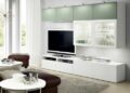
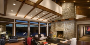
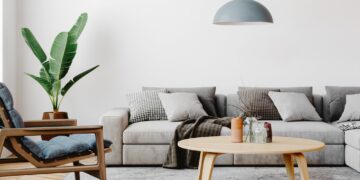
Living rooms with plenty of windows let Agreeable Gray show off its warm side. It creates a soft, welcoming feel that makes people want to stay and chat.
In bedrooms, it sets a calm mood without feeling too dark or too light.
Hallways painted in this color flow nicely between rooms, making your whole house feel put together.
Even in basements, it can add some warmth to spaces that might otherwise feel too cool or dark.
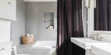
Can You Use Agreeable Gray in Kitchens and Bathrooms?
Yes- Agreeable Gray works great in both kitchens and bathrooms.
On walls, it pairs well with white or cream cabinets. If you’re thinking about painting cabinets, this color looks clean and classic while hiding small marks better than pure white.
For countertops, it goes well with white quartz, light granite, or marble patterns.
In bathrooms, it makes a nice backdrop for white tile and chrome fixtures, and it holds up well in spaces with moisture.
Does Agreeable Gray Work with Other Colors?
Getting the color combinations right can make a big difference in how good your paint looks.
Let’s look at which colors work best with Agreeable Gray to create a pulled-together look.
What Trim Colors Go With Agreeable Gray
Sherwin Williams Pure White (SW 7005) is a perfect partner for Agreeable Gray. It is clean without being too stark.
Extra White (SW 7006) also works well if you want a brighter look.
The key is picking whites that have a bit of warmth to them.
This helps them blend naturally with Agreeable Gray instead of creating too much contrast.
A warm white trim helps the whole room feel more connected and cozy.
Cabinet and Accent Colors for Agreeable Gray
With light cabinets, Agreeable Gray creates a soft, unified look that makes your space feel bigger.
Dark cabinets create more drama while still looking balanced.
For accent colors, try soft blues, gentle greens, or warm tans – they all work nicely without fighting for attention.
If you want something bolder, navy blue or charcoal gray can add some punch without looking out of place.
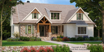
Is Agreeable Gray a Good Choice for Exterior Paint?
Most people find that Agreeable Gray makes an excellent exterior color choice. It provides a balanced look that works across many home styles and materials.
Let’s see how it performs outside.
Exterior Use of Agreeable Gray

Agreeable Gray gives your house a fresh look, striking the right balance between light and dark.
It suits the main walls, trim, and even painted brick. The color remains consistent in outdoor light and resists fading.
When paired with stone, it enhances the warm tones, and with wood accents, it finds a pleasing balance between modern and rustic.
It effectively hides dirt and marks, making it practical for busy families.
In bright sunlight, it maintains its vibrancy, while on cloudy days, it exudes warmth, creating a welcoming atmosphere.
Many homeowners appreciate its subtle color changes throughout the day.
Is Agreeable Gray Still Popular?

Paint colors come and go, but some stand strong through changing trends.
Let’s look at how Agreeable Gray fits into today’s design choices and how it compares to other options.
Current Trends for Agreeable Gray
Agreeable Gray remains a top paint choice for its blend of classic and modern appeal.
It pairs well with white kitchens and mixed materials, offering a clean yet cozy atmosphere.
- Compared to Sherwin Williams Repose Gray, Agreeable Gray has more warmth, ideal for cozy spaces.
- Against Accessible Beige, it appears modern and fresh.
- Benjamin Moore’s Revere Pewter resembles Agreeable Gray but is slightly darker.
These distinctions highlight why Agreeable Gray is favored for new and updated homes.
It aligns with trends like natural materials and simple styles, complementing popular wood and stone tones.
Agreeable Gray is a smart choice for those seeking a timeless paint color.
Conclusion
Still unsure if Agreeable Gray is right for your home?
It’s a color that shifts between warm and cool, giving you different looks throughout the day.
This makes it perfect for spaces where you want a paint color that can handle changes in light without losing its charm.
Before you buy gallons of paint, get a sample and put it on a few walls in your space.
Look at it during morning coffee, afternoon tasks, and evening relaxation. Pay attention to how it works with your furniture and floors.
Most importantly, make sure you like how it feels in your space – after all, you’re the one who’ll be living with it every day.