


Choosing the right paint color can greatly affect how your home looks and feels.
Repose Gray (SW 7015) by Sherwin-Williams has become a trusted choice among homeowners and interior designers.
This gentle gray shade offers flexibility and power in home design, making it a reliable option for various spaces.
In this guide, we’ll look at how Repose Gray works and the coordinating colors that create spaces to match your style.
You’ll learn about the best color combinations, get practical advice from design experts, see what’s current in home design, and find real examples of this versatile shade in action.
Understanding these color relationships will help you make confident choices when painting one room or your entire home.
What is Repose Gray?
Repose Gray (SW 7015) is a mid-tone gray paint color that sits perfectly between warm and cool.
When you look closely, you’ll notice soft brown and purple undertones that give this gray its welcoming feel.
Light plays a big role in how this color appears on your walls. In bright, natural sunlight, Repose Gray appears lighter and cleaner.
It takes on a deeper, cozier look during evening hours or in rooms with less light. The color can also pick up hints of blue in north-facing rooms.
The paint finish you choose matters just as much as the color itself.
Each finish serves a specific purpose, from hiding small wall imperfections to standing up to daily wear and tear.
Coordinating Colors for Repose Gray
Neutral Color Partners
Repose Gray with other neutrals to create a clean, put-together look in your home.
SW Pure White works well for trim and ceilings, making the gray stand out nicely.
For a softer look, SW Eider White adds a touch of warmth without being too different.
BM Stonington Gray makes a good partner when you want to use two grays that work well together.
Cool Blue Options
When you want to add some blue to your space, SW Naval creates strong contrast as an accent wall or cabinet color.
BM Hale Navy offers a softer blue option that doesn’t overpower the room but adds interest.
Warm Colors That Work
SW Accessible Beige brings warmth to spaces where you want a cozier feel. SW Urbane Bronze is a rich accent for a stronger look, making Repose Gray look even more refined.
Light Reflectance Value (LRV) of Repose Gray
Repose Gray has an LRV of 58, placing it in the medium-light range on the brightness scale.
Repose Gray won’t wash out completely in rooms with lots of natural light. It won’t make the room feel too dark or closed in spaces with less light.
This balanced LRV makes Repose Gray versatile for different room sizes and lighting conditions.
Repose Gray creates a subtle contrast when paired with lighter colors (LRV 65+).
Next to darker colors (LRV 40 or below), it appears significantly lighter and can help brighten a space.
Best Trim Colors for Repose Gray
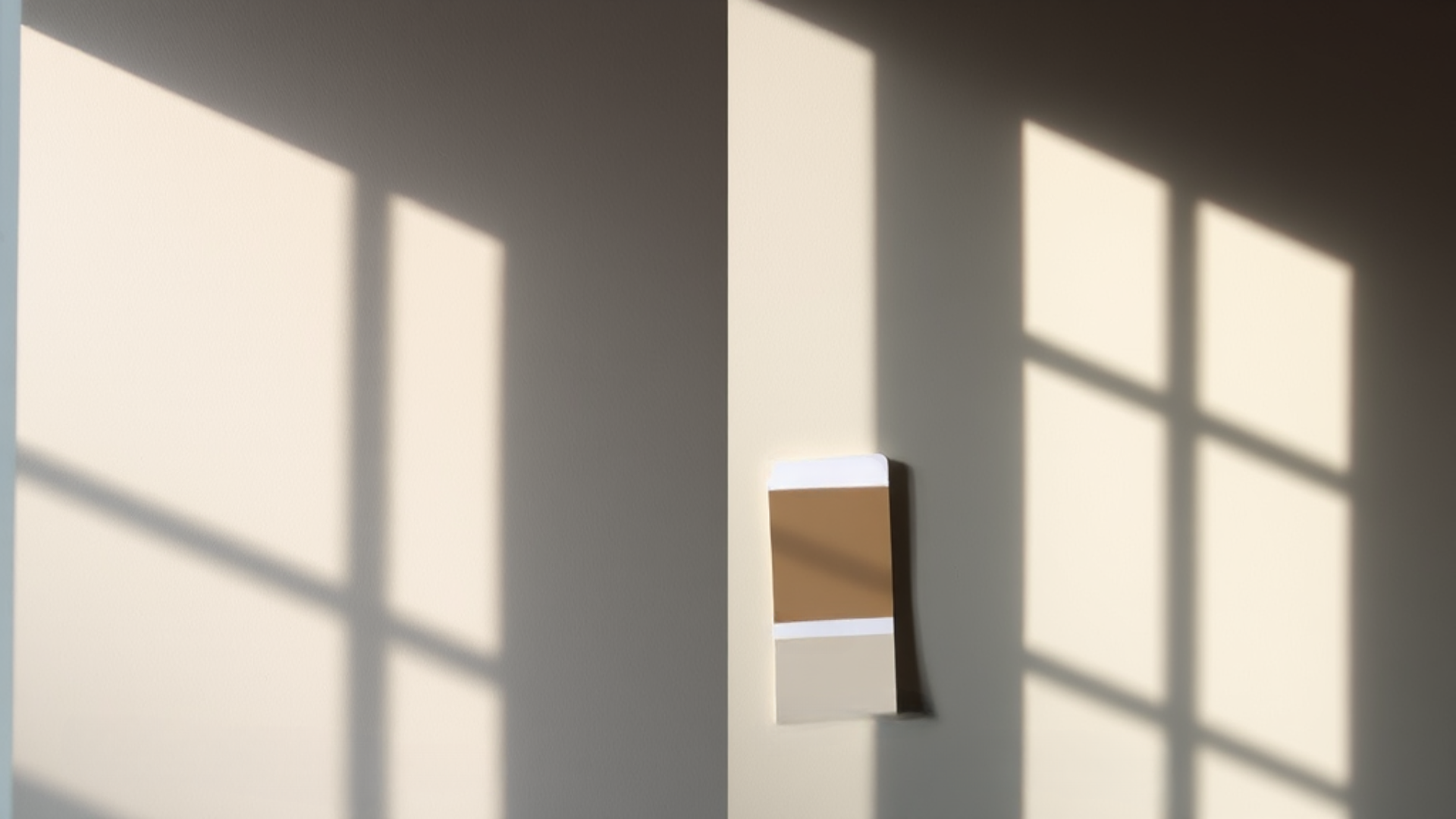
Testing Paint Samples
Different lighting changes how Repose Gray looks:
- Morning light: The color appears cooler and brighter
- Afternoon sun: Shows warmer undertones
- Cloudy days: Gray looks more true to color
- Light bulbs: LED lights show it differently than incandescent
Sample Testing Tips:
- Paint 2×2 foot squares on multiple walls
- Look at samples for several days
- Check colors near windows and far corners
- View samples next to trim and flooring
- Test with your room’s actual lighting
Where to Get Samples
You can get Repose Gray samples from:
- Sherwin-Williams stores (sample pots)
- Hardware stores that carry SW paints
- Online orders from the SW website
- Paint sample cards from SW dealers
Expert Color Scheme Tips
- Start with Repose Gray on the main walls
- Use white trim for clean lines
- Add one dark accent color
- Include one warm-tone
- Consider connecting room colors
Sample Colors to Buy:
- Repose Gray (SW 7015)
- Pure White (SW 7005) for trim
Remember to buy enough paint in the same batch number to ensure color consistency throughout your space.
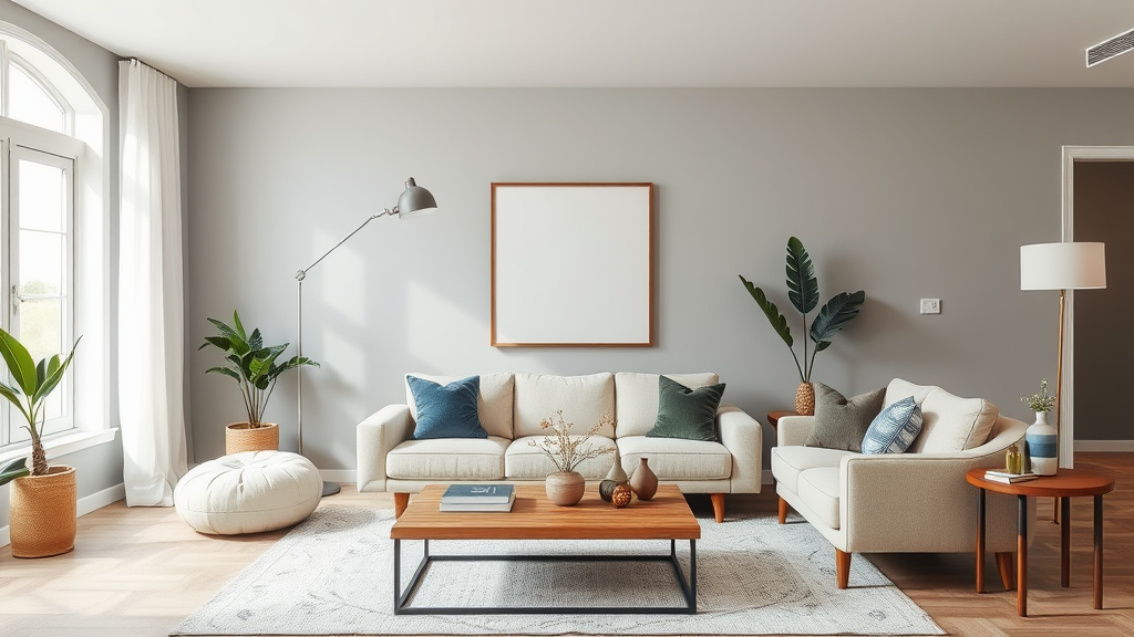
Repose Gray in Different Spaces
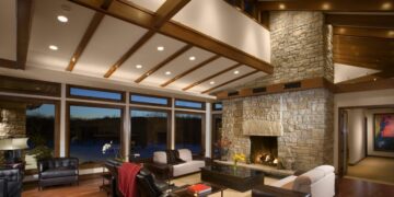
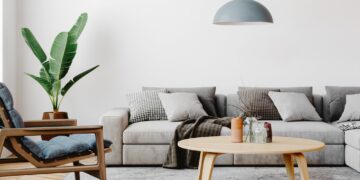
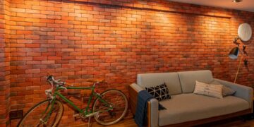
Living Room
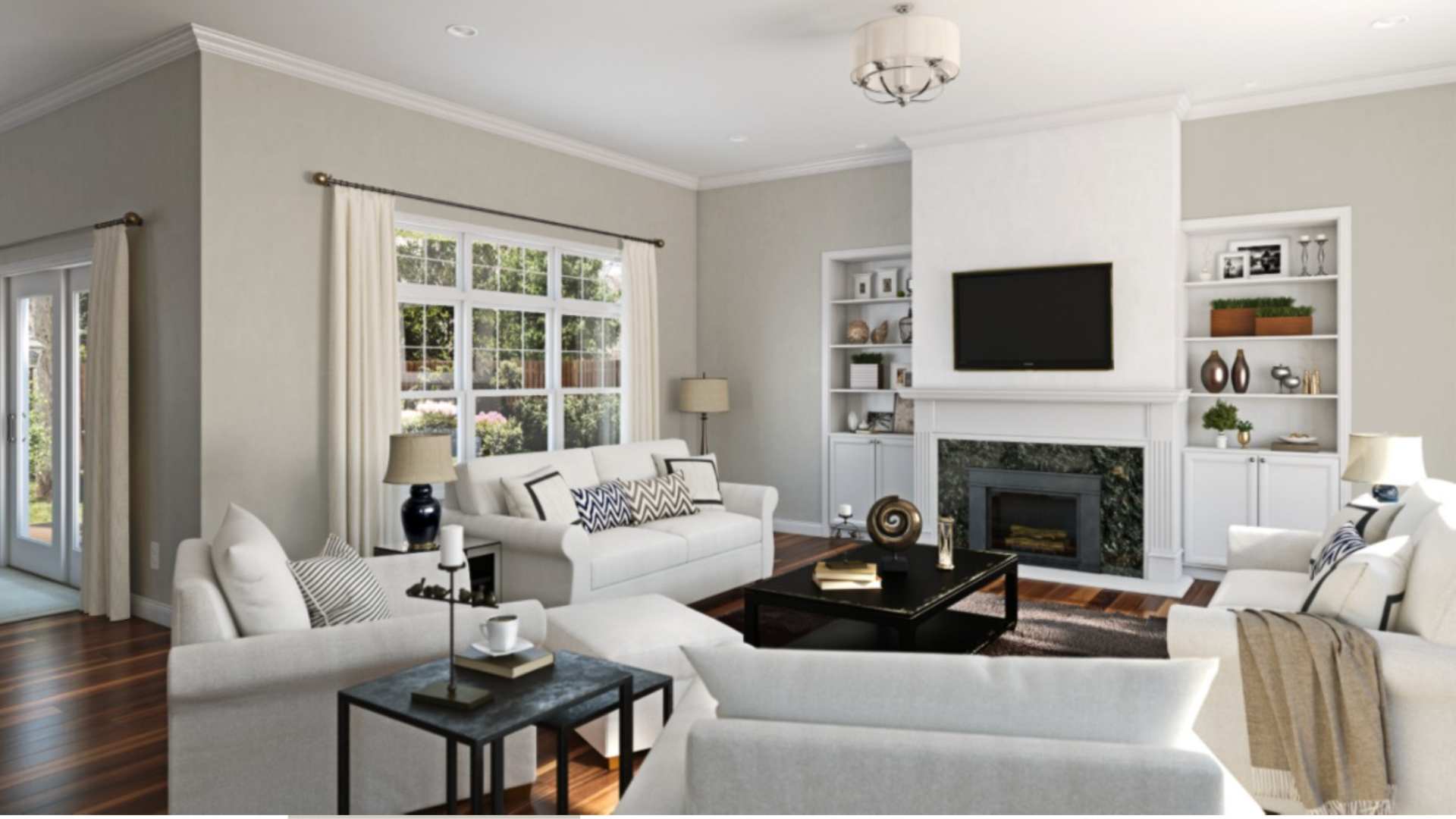
A living room painted in Repose Gray gives you many options for your style choices.
For a cozy look, pick beige, brown, or rust-colored rugs. These warmer shades make the space feel welcoming and comfortable.
Try rugs with blue, gray, or white patterns if you prefer a fresher feel.
Kitchen
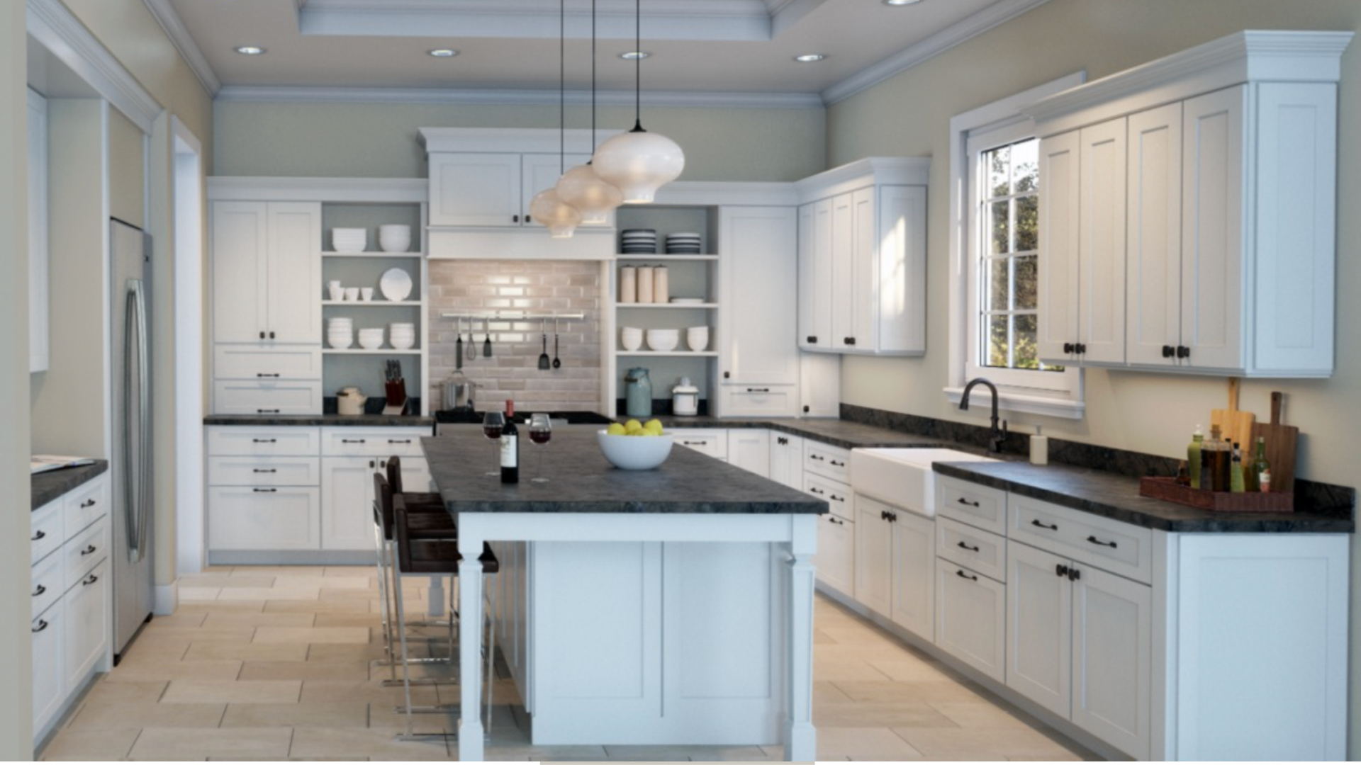
Repose Gray walls look great with white cabinets, making kitchens feel bigger and brighter.
If you want something bolder, try navy cabinets – they look good year after year.
When choosing countertops, white quartz keeps things simple and clean.
Gray-veined marble or marble-look materials add natural patterns.
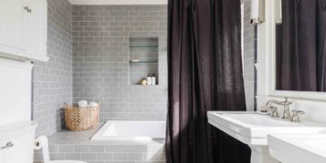
Bathroom
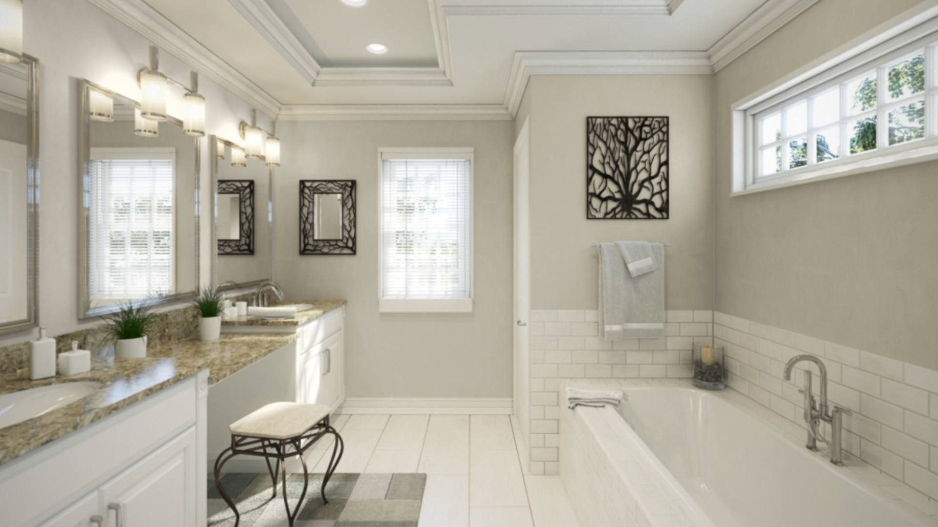
White vanities against Repose Gray walls give bathrooms a clean, fresh look.
Dark wood vanities create a nice contrast.
Light gray tiles work well on the floor, while white subway tiles on walls keep things bright. Chrome or brushed nickel fixtures complete the look.
Bedroom
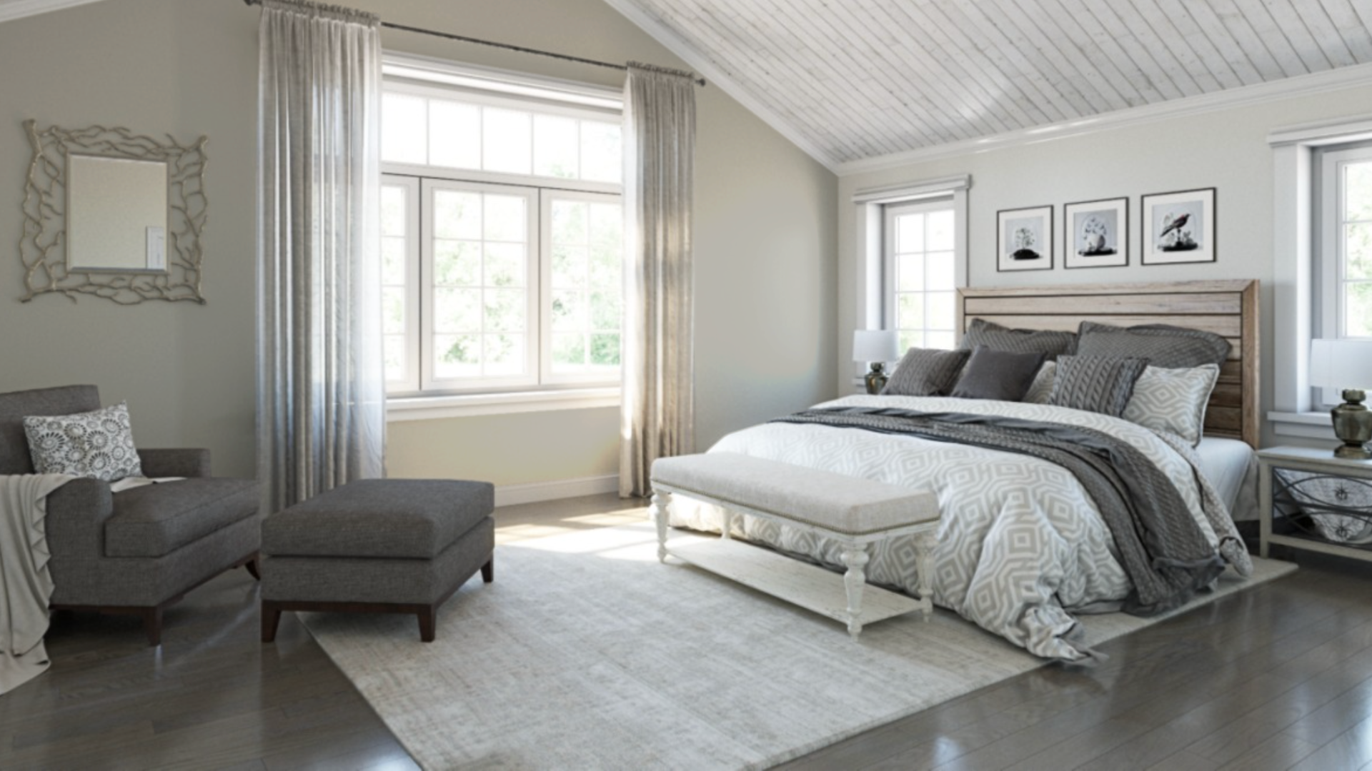
Your bedroom can feel peaceful with simple white bedding, calming, soft blue pieces, or comfortable, warm beige choices.
Medium-toned wood furniture looks natural in the space.
White-painted pieces keep things light, while light-colored upholstered headboards add softness.
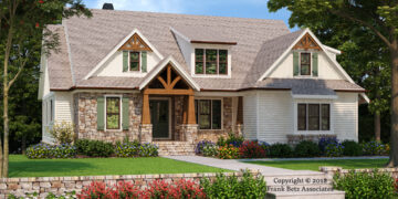
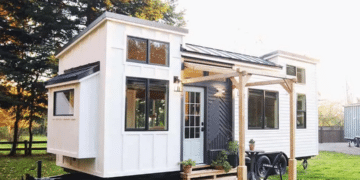
Exterior
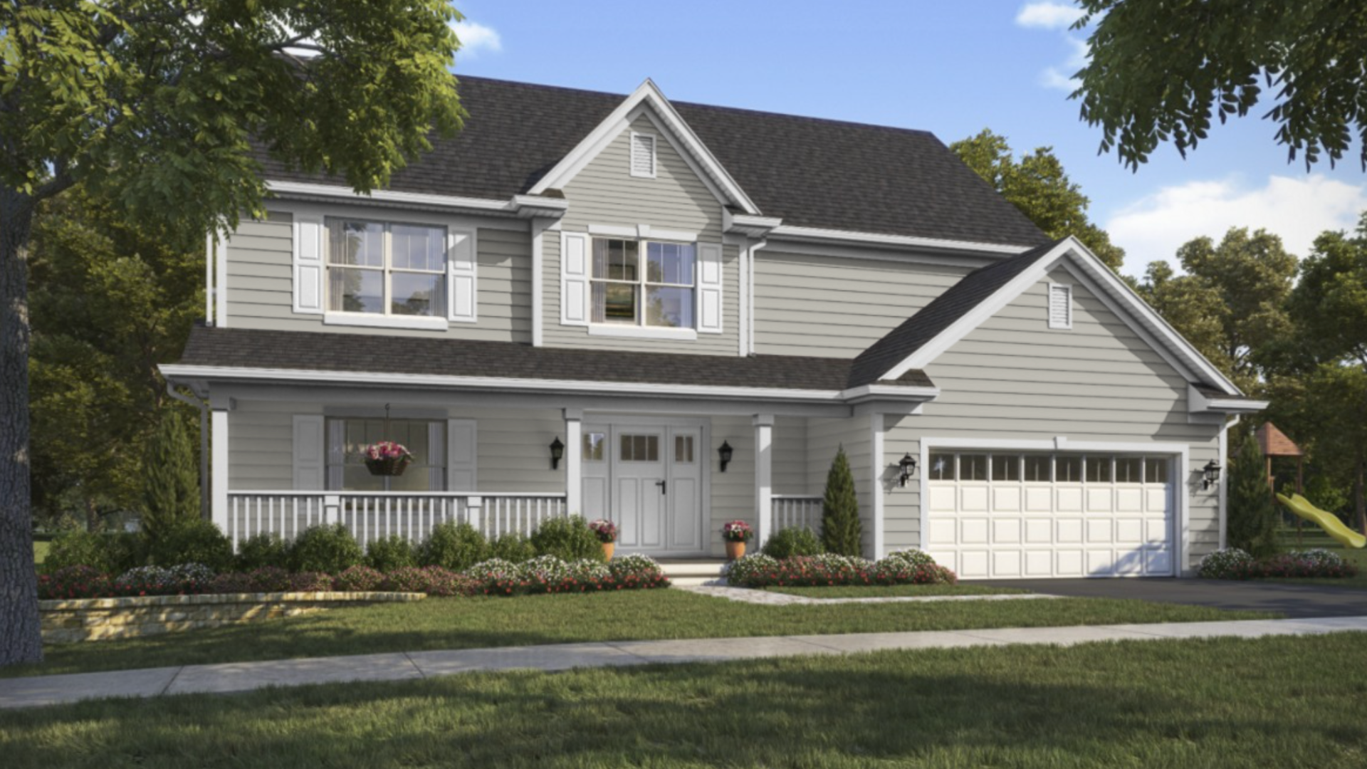
Outside your home, Repose Gray siding works with several trim colors.
Bright white trim creates clear lines, while off-white gives a softer look. Black shutters add nice detail.
For your front door, black keeps things classic, navy blue adds interest, and dark bronze brings warmth.
Always check these color combinations in your space – colors can differ depending on your lighting and room setup.
Is Repose Gray Still Trendy in 2024-2025?
Repose Gray continues to work well in modern homes and keeps its usefulness because it works with both current and classic styles.
Today’s Homes Often Mix Repose Gray With
- Warmer whites instead of stark white
- Natural materials like wood and stone
- Textured fabrics and surfaces
- Metals in mixed finishes
Modern Color Partners
For an up-to-date look, designers often pair Repose Gray with:
- Soft whites that feel welcoming
- Deep green-blacks for contrast
- Warm browns that add richness
- Muted blues that feel current
What Design Experts Say
Interior designers note that Repose Gray stays useful because it:
- Works well with changing color trends
- It provides a reliable base for different styles
- Maintains its appeal in real estate
- It helps spaces feel current without being tied to one specific trend
The key to using Repose Gray today is treating it as a supporting color that lets other design elements shine rather than making it the main focus of your color scheme.
Common Mistakes to Watch For
People often make these errors with Repose Gray:
- Not testing in their specific lighting
- Use it in rooms that need more warmth
- Picking the wrong paint finish
- Missing undertones that clash with furnishings
- Not considering existing floor colors
Professional painters suggest using high-quality materials and proper wall preparation for the best results with Repose Gray.
Repose Gray vs. Other Popular Grays
| Basis of Comparison | Repose Gray (SW 7015) | Agreeable Gray (SW 7029) | Mindful Gray (SW 7016) | Alabaster (SW 7008) |
|---|---|---|---|---|
| Undertones | True gray with slight purple undertones | Brown undertones (true greige) | Noticeable brown undertones | Soft warm white undertones |
| Light Appearance | Appears cooler in certain lighting | Appears neutral in most lights | Requires more light to avoid heaviness | Appears almost white in all lighting |
| Depth/Intensity | Mid-tone gray | Similar depth to Repose but warmer | Noticeably darker than Repose | Much lighter, almost white |
| Space Application | Works well in open floor plans | Great for open spaces with a warmer feel | Better for creating cozy, defined spaces | Best for trim, ceilings, or full rooms needing brightness |
| Light Requirements | Flexible in various lighting conditions | Consistent in different lighting | Needs more natural light | Very forgiving in all lighting situations |
| Pairing Ability | Pairs easily with different color schemes | Works well with warm accents | Creates defined, warm environments | Pairs excellently with any of the other grays as trim |
| Contrast Potential | Creates moderate contrast with white trim | Creates subtle contrast with white trim | Creates strong contrast with white trim | Creates minimal contrast when used with other whites |
Remember: The best choice depends on your specific room, lighting, and the look you want to create.
Final Thoughts
Repose Gray offers a flexible choice for your home that works in many rooms and with many styles.
Whether updating one room or your whole house, Repose Gray gives you a reliable backdrop for furniture and decor.
It plays well with whites, blues, and warm accent colors, letting you change your style while keeping your walls the same.
Creating a Cohesive Color Scheme:
- Pair warm mid-tones like terracotta, rust, or beige for balance.
- Use Alabaster for trim and ceilings for a soft contrast.
- Choose wood tones, navy, or charcoal furniture to complement the gray.
Testing, pairing, and adjusting colors will help create a space that feels just right.
Frequently Asked Questions
Where to Get Repose Gray Samples?
You can order Sherwin-Williams sample pots online or pick up swatches at a local store. Peel-and-stick samples are also a mess-free option.
What are the Complementary Colors for Repose Gray?
Warm mid-tones, such as soft terracotta, muted rust, and warm beige, pair well with Repose Gray’s cool undertones, creating a natural balance.
Repose Gray Trend in 2025?
Though warmer tones are trending, Repose Gray remains a versatile neutral.
Its balanced undertones help it blend with modern color palettes, making it a go-to choice for open spaces.