


Looking for a paint color that feels right in any room? Seapearl OC-19 by Benjamin Moore might be exactly what you need.
This gentle off-white paint brings together soft gray and beige tones to create a warm, welcoming feel in your space.
More and more homeowners are choosing Seapearl for both their indoor and outdoor walls because it works so well with different styles and lighting conditions.
What makes this color special is how it can make a room feel both fresh and cozy at the same time.
It’s like having a blank canvas that somehow manages to be interesting on its own – not too warm, not too cool, but just right.
What Makes Seapearl Benjamin Moore Special?

When you’re looking at paint colors, small details make a big difference.
Seapearl stands out because it knows how to play nice with other colors while still holding its own character.
Here are some unique points that make this paint color so special.
Color Characteristics
Seapearl isn’t your basic white paint – it’s got personality.
Think of it as a soft, creamy color that mixes gray and beige in just the right way.
It’s warmer than pure white but doesn’t feel heavy or dark.
When you put it next to stark white, you can see its gentle warmth, making rooms feel more like home.
Undertones of Seapearl
The magic of Seapearl is in its clean undertones.
It has a light gray base that keeps things fresh without any unwanted pink or purple showing through.
This makes it easy to use with any furniture or decor you already have.
The color stays true and doesn’t surprise you by changing its look throughout the day.
Light Reflectance Value (LRV)
Here’s something cool about Seapearl – it has an LRV of 77.4.
In simple terms, this means it bounces back a lot of light into your room. This high LRV helps make spaces feel bigger and brighter.
It’s like having natural light helpers on your walls, making rooms feel open and fresh without being too bright.
Ideal Applications for Seapearl

Picking the right spots for Seapearl can really make your home shine.
This paint color works well in many spaces, each bringing out different qualities that make it special.
Let us help you figure out where it fits best in your home.
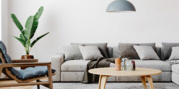
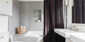
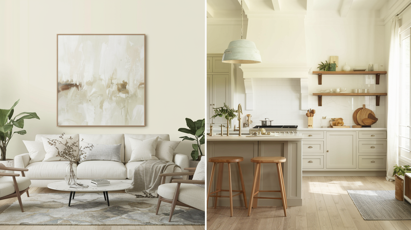
Best Rooms for Seapearl
Seapearl feels right at home in any room, but it really shines in certain spots.
In living rooms and bedrooms, it creates a peaceful mood that helps you relax.
Kitchens and bathrooms look clean and fresh with this color.
If you have rooms that face north and don’t get much sun, Seapearl helps brighten them up.
Small rooms also feel bigger and more open with this light shade on the walls.
Seapearl in Open Floor Plans
When your rooms flow into each other, Seapearl helps tie everything together.
It creates a smooth look from one space to the next without making things boring.
Kitchen cabinets painted in Seapearl look crisp and clean, while dining areas feel warm and inviting.
This color lets your furniture and decor stand out while keeping the background simple and pulled together.
Coordinating Colors with Seapearl

The right color combinations can make your space feel put together and personal.
Seapearl plays well with others, making it easy to create the perfect mix for your home.
Take a look at some great color matches and ways to add extra style.
Complementary Colors for Seapearl
Seapearl makes other colors look their best.
- Deep navy blue creates a bold, clean look that feels fresh.
- Soft sandy beige brings extra warmth and comfort to any room.
- Want a calm, beach-house feel? Try mixing it with light blue shades like Beach Glass or Palladian Blue.
These pairings help create spaces that feel both pulled together and relaxed.
Metal and Wood Accents
Adding natural touches brings life to your Seapearl walls.
- Dark or light wood furniture adds warmth and makes rooms feel more lived-in.
- Metal pieces in gold, silver, or bronze catch light and add interest.
Mix different textures – smooth metals with rough wood for example – to create spaces that feel rich and personal without being too busy.
Seapearl Benjamin Moore for Exterior Use

Your home’s outside color sets the mood for everyone who visits.
Seapearl makes a great choice for exterior walls, bringing a soft, welcoming look that fits into any neighborhood.
Best Exterior Applications
Seapearl brings a clean, classic look to your home’s outside walls. It’s strong enough to stand out but gentle enough to look natural.
When paired with brick, it creates a perfect balance – the soft white works with both red and brown brick to make your home look fresh and current.
Paint your trim Seapearl to give your home a clean, put-together look that feels right.
Seapearl in Various Lighting
The sun changes throughout the day, but Seapearl keeps up nicely.
In bright sunlight, it stays soft and true without looking too stark. During cloudy days, it maintains its warmth instead of turning dull.
Even as shadows move across your home, this color holds steady and keeps your house looking welcoming from morning until night.
Seapearl vs. Other Popular Paint Colors

It helps to look at different paint colors side by side to find the one that’s just right for you.
Let’s compare Seapearl with some other popular choices to see what makes each one special.
Seapearl vs. Classic Gray
When you put these colors next to each other, you’ll notice right away that Seapearl feels warmer and more inviting.
Classic Gray leans into its cool side, making spaces feel more modern but less cozy.
While both colors work well in most rooms, Seapearl brings more comfort to your walls while Classic Gray keeps things crisp and clean.
Seapearl vs. White Dove
White Dove feels like a warm hug – it’s got yellow undertones that make it very cozy. Seapearl sits more in the middle, not too warm or cool.
Think of White Dove as your favorite cream-colored sweater, while Seapearl is like that perfect white t-shirt that goes with everything.
Each has its sweet spot, but Seapearl is easier to match with other colors.
Seapearl vs. Swiss Coffee
Swiss Coffee brings tan undertones that make it feel like a light latte color.
Seapearl’s gray base keeps it neutral and fresh. Swiss Coffee works better in rooms where you want extra warmth, like cozy dens or reading nooks.
But Seapearl fits in anywhere – from bright kitchens to formal living rooms – because it stays balanced.
Tips for Using Seapearl
Getting the most out of any paint color means using it the right way.
Here are some helpful tips to make sure Seapearl looks its best in your home.
Testing Seapearl in Your Space
Before you buy gallons of paint, try Seapearl in your own space first.
- Get some peel-and-stick samples and put them up on different walls.
- Look at them in the morning light, afternoon sun, and after dark with your lights on.
- Move the samples around to different spots – near windows, in corners, and next to your furniture.
This extra step helps you feel sure about your choice before you commit.
Best Trim and Ceiling Colors for Seapearl
Your trim and ceiling colors can make Seapearl look even better.
Chantilly Lace works great for both. Its clean lines make Seapearl stand out in just the right way.
This combo gives your room a fresh, pulled-together look without feeling too stark.
The contrast is just enough to add interest while keeping the peaceful feel that makes Seapearl special.
DIY Painting Tips for Seapearl
Paint can make a big difference in how your home looks and feels. Seapearl is a great color choice that can make your rooms feel bright and welcoming.
Here are some helpful tips to make your painting project go smoothly.
How to Prep Walls Before Painting
Getting your walls ready is key to a good paint job.
- Start by cleaning the walls with soap and water to remove dirt and dust.
- Fill any holes with spackling compound and sand the spots once they’re dry.
- Use painter’s tape along edges and trim for clean lines.
- A quick wipe-down with a damp cloth right before painting helps the paint stick better.
Recommended Finishes
Each paint finish gives a different look to your walls:
- Matte: This finish hides small flaws well and gives a soft, smooth look. It’s great for bedrooms and living rooms.
- Eggshell: A subtle, low-shine finish that’s easy to clean. Works well in most rooms.
- Satin: Has a bit more shine and stands up well to cleaning. Good for kitchens and bathrooms.
Common Mistakes to Avoid
Take your time with prep work – rushing leads to messy results.
- Don’t skip the primer, especially on bare drywall or patched areas.
- Make sure to stir your paint well, and keep a “wet edge” while painting to avoid visible lines.
- Let each coat dry fully before adding another one.
Conclusion
The right paint color makes all the difference in how you feel at home.
Seapearl by Benjamin Moore stands out with its balanced blend that works both inside and out.
It’s one of those rare colors that stays true in any light without going too yellow in the sun or too gray in the shade.
When you want a color that will look good for years to come, Seapearl is a solid pick.
Its soft undertones bring out the best in your space while letting you switch your style up whenever you want.
For anyone wanting a color that feels like it was made for their home, Seapearl delivers that perfect mix of comfort and style.