


Are you looking for a soft paint color that works in any room?
White Duck Sherwin Williams undertones offer a calm mix of gray and beige.
This off-white color looks good in both light and dark spaces.
In this blog, we’ll explain what makes White Duck special. You’ll learn about its light reflectance, how it compares to other whites, and where it works best in the home.
We’ll also talk about how it changes in different lighting, how to pair it with other colors, and tips for using it inside and out.
If you want a safe, clean look, this guide will help.
Overview of Sherwin Williams’ White Duck

White Duck (SW 7010) is a soft, off-white paint color between warm and cool. It works well in many types of rooms and with different lighting conditions.
This paint color has become popular for homes and offices because it’s not too bright or dull.
Key Characteristics
White Duck has a light gray base with slight warm hints. It’s not a stark white, which makes it easier on the eyes.
Its strength lies in how it shifts with light – in bright spaces, it appears lighter and cleaner, while in darker areas, it shows its warmer side.
The color has an LRV (Light Reflectance Value) of 74, reflecting a good amount of light without being too bright.
Why Does It Stand Out?
Many designers choose White Duck because it’s so adaptable. It pairs well with both modern and traditional furniture styles.
The color doesn’t compete with other design elements but creates a clean background.
It works especially well in rooms with different amounts of light throughout the day, as it keeps its basic character while subtly shifting to match the lighting.
LRV of White Duck
With an LRV of 74, White Duck reflects just the right amount of light, brightening rooms without creating glare.
In sunny rooms, it stays soft and comfortable. In darker spaces, it helps bounce light around while keeping its warm qualities.
This balance makes it work well in both north and south-facing rooms.
Comparative Analysis
Comparing White Duck’s undertones with other popular whites from Sherwin Williams to highlight its distinctiveness.
Alabaster (SW 7008): A Slightly Warmer White

Alabaster’s soft cream and yellow tones make it feel warmer than White Duck. It’s great for cozy spaces.
White Duck, by comparison, stays more neutral, working better in rooms where you want a balanced, not-too-warm look.
Greek Villa (SW 7551): A Brighter, Cleaner White

Greek Villa is brighter and crisper than White Duck. Its clean white look works well in sunny rooms.
White Duck, being softer and more muted, feels more relaxed and blends better in spaces with natural or warm light.
Drift of Mist (SW 9166): A Grayer Option

Drift of Mist leans toward true gray tones, offering a cooler look than White Duck’s soft beige-gray blend.
If you like a more modern feel, Drift of Mist may suit your space better than the warmth found in White Duck.
Shoji White (SW 7042): A White with Sandy Undertones

Shoji White shows stronger sandy-beige tones than White Duck. It feels warmer and slightly deeper, great for cozy, natural-themed spaces.
White Duck stays more subtle, making it easier to pair with a wider range of styles and finishes.
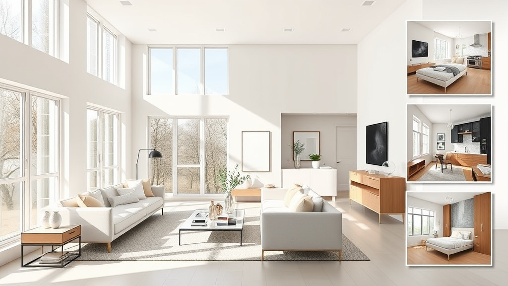
White Duck Works in Any Room
White Duck looks different in various rooms. Take a look at the undertone below in different rooms.
Living Room
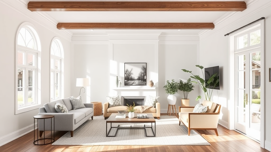
White Duck creates a calm base in living spaces that works with any decor style.
The color stays balanced throughout the day, making your room feel open and bright without being stark.
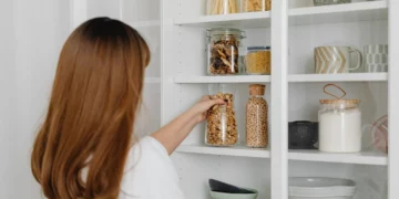
Kitchen
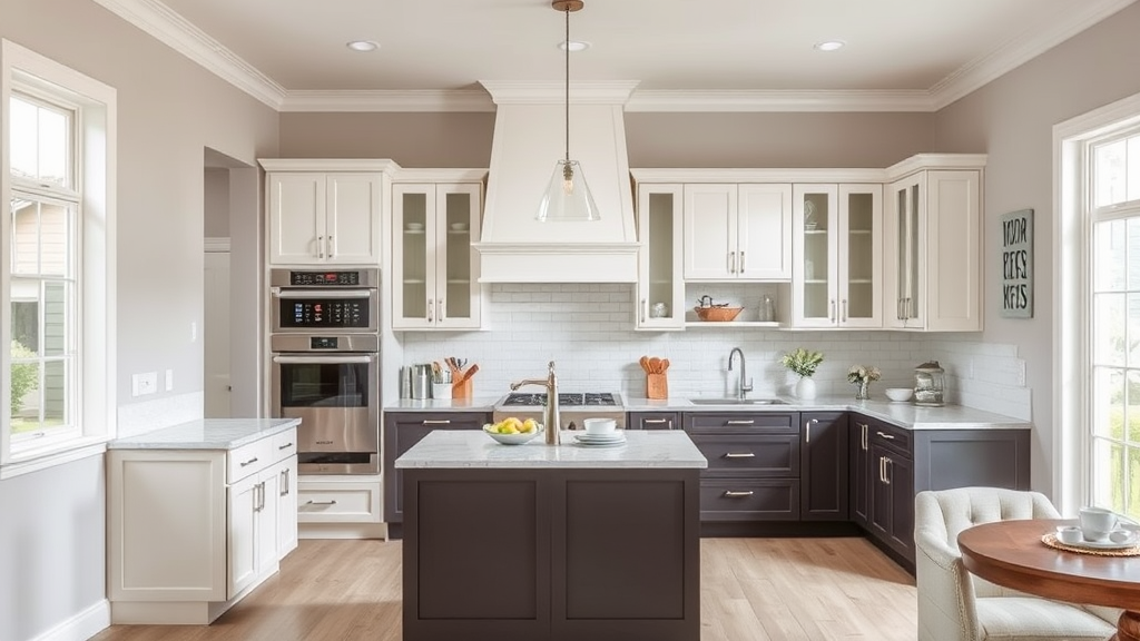
In kitchens, White Duck offers a clean but soft look. It pairs well with both dark and light cabinets.
The warm neutral tone hides splashes and marks better than bright whites, making it a smart and stylish choice for everyday use.
Bedroom
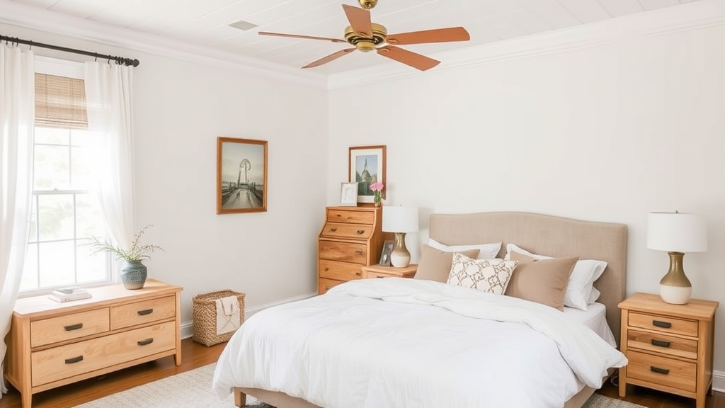
White Duck is great for bedrooms. Its warm gray-beige blend creates a peaceful feel that supports sleep.
The soft tone works with all types of bedding and furniture, from wood to metal, giving your room a relaxed and balanced atmosphere.
Bathroom
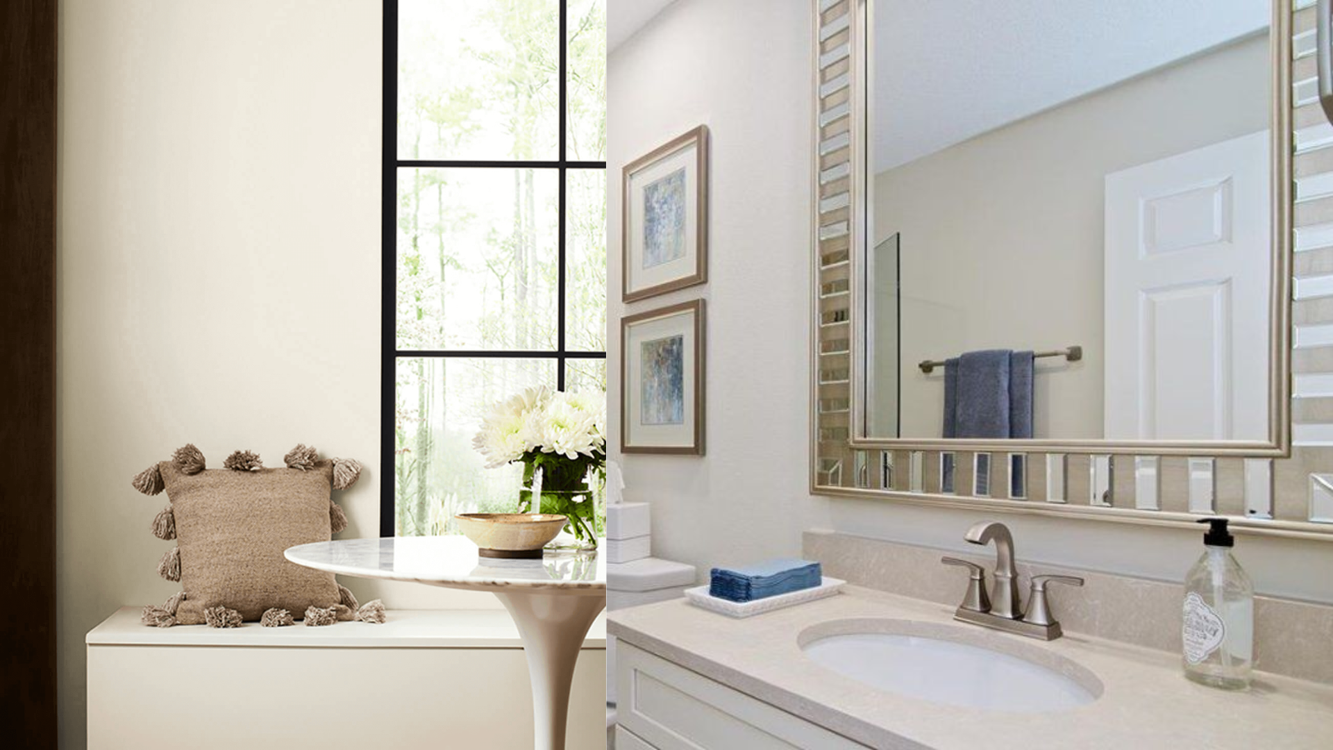
This shade holds up well in changing light, making it ideal for bathrooms.
White Duck adds depth without looking dull and pairs beautifully with white fixtures.
It keeps the space bright and clean while adding just enough softness for comfort.
Analyzing the Undertones in White Duck
White Duck combines soft gray and gentle beige notes to create a balanced neutral.
The mix stays steady without leaning too warm or cool, making it work in many settings.
None of its undertones takes over, letting it blend with both cool and warm colors.
Primary Undertones
The color has a light gray base with hints of beige and cream. These mix to create a neutral that stays true in most lights and spaces.
Lighting Effects
Morning light brings out the beige notes.
Midday shows its true, neutral nature. Evening light reveals more gray.
LED lights keep it true, while warm bulbs highlight its softer side.
Complementary Colors & Design Pairings
White Duck pairs well with earth tones, blues, and grays. Its neutral base makes it flexible with most color schemes, from soft to bold.
Color Pairing Strategies
- Sage green and blue-gray add calm depth
- Charcoal or navy creates a modern contrast
- Warm browns and tans blend smoothly
- Soft blues create a fresh look
Practical Tips for Pairing
- Mix textures like linen, wool, or velvet to add interest
- Use matte and glossy finishes to create depth
- Add natural materials like jute or woven grass
- Layer different white tones for subtle contrast
Exterior Paint Suitability
White Duck performs well outside. It stays true in sunlight and doesn’t look too stark. The color works nicely on:
- Main house body
- Trim around windows
- Front doors
- Garage doors
Note: Test samples in your outdoor lighting before committing to the full exterior.
Compatibility with Wood Trims & Cabinets
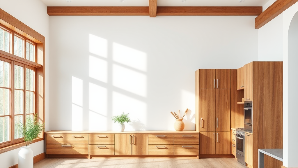
White Duck works with most wood tones. It looks great with oak, maple, and walnut.
The color balances well against light and dark woods, making it perfect for trim and cabinet pairings.
Tips for Successfully Using White Duck
Some helpful tips for using White Duck are covered below.
Preparation & Testing
Start by painting large test squares on different walls in your space.
Watch these samples throughout the day, from morning light to evening, and under your regular lighting.
Place pure white paper next to your samples to see the true undertones.
Look at the color next to your existing trim, floors, and main furniture pieces to see how they complement each other.
Application Techniques
Begin with a quality white primer to create the right base. Select high-quality brushes and rollers with shorter naps for the smoothest finish.
Apply your paint in thin, even coats, allowing proper drying time between each layer.
Most spaces need 2-3 coats for perfect coverage. Good lighting while painting helps catch any missed areas or uneven spots.
Common Pitfalls
Many people skip proper testing and rush into painting, leading to disappointing results.
- Poor-quality tools can leave marks and texture in your finish.
- Not checking the color in all lighting conditions might give unexpected results later.
- Take time between coats – rushing can cause peeling or uneven coverage.
- Clean walls thoroughly and fix any surface problems before starting, as White Duck shows wall flaws more than darker colors.
- Use the right primer shade, as it affects your final color.
In-Depth Paint Color Review
Sherwin Williams White Duck (SW 7010) offers a soft, warm, off-white shade that works well in many spaces. This paint blends cream, tan, and gray notes to create a balanced, neutral color.
The White Duck shows more of its cream side in the morning light.
During midday, it appears as a clean off-white. By evening, the gray undertones become more noticeable. This color changes subtly throughout the day but stays mild and pleasant.
White Duck pairs nicely with pure white trim, creating a calm background for artwork and furniture.
It’s neither warm nor cool, making it a good fit for modern and traditional homes.
Many homeowners choose it for living rooms, bedrooms, and kitchens because it’s adaptable.
Conclusion
White Duck Sherwin Williams undertones make it a great pick for anyone wanting a soft and flexible paint color.
It fits into almost any space and complements many design styles. You can use it in your kitchen, bedroom, or even outside.
Before painting, test samples in a different light to be sure they work in your room.
Use good tools and take your time with each coat. Try painting a small area first and checking it throughout the day.
With a little planning, White Duck can help you create a space that feels clean, warm, and just right.
Frequently Asked Questions
Does White Duck Look Yellow in Artificial Lighting?
No, White Duck maintains its neutral balance under most artificial lights. While warm bulbs might slightly enhance its cream undertones, it doesn’t turn yellow like some off-whites can.
Can White Duck Work with Cool-Toned Flooring?
White Duck’s balanced undertones allow it to coordinate well with warm and cool flooring options. Its subtle gray notes help it blend seamlessly with cool-toned materials like gray tiles, while its warm aspects prevent harsh contrasts.
How Does White Duck Compare to Benjamin Moore’s White Dove?
While both are popular off-whites, the White Duck has more gray in its base than the White Dove. While the White Dove shows stronger cream undertones, the White Duck stays neutral and can handle bright light without appearing too creamy.